
Design · 2026-10-12
The Rolex design language: why evolution beats reinvention
An extended design essay on the Oyster case, Submariner, Datejust, Explorer, GMT-Master II and Cosmograph Daytona.
Save this watch to revisit later.
Share this article
By Chronolume digest · Original English summary · Based on Rolex official collection and product pages
What to know
Rolex is recognised almost instantly, even when its logo is obscured. That recognition comes from a coherent visual language refined across decades: the Oyster case, confident proportions, precisely differentiated bezels and consistent dial graphics. Rather than chase new silhouettes with every collection, the brand tends to evolve established forms. The strategy is sometimes criticised as conservative, but viewed as product design, it is strikingly disciplined.
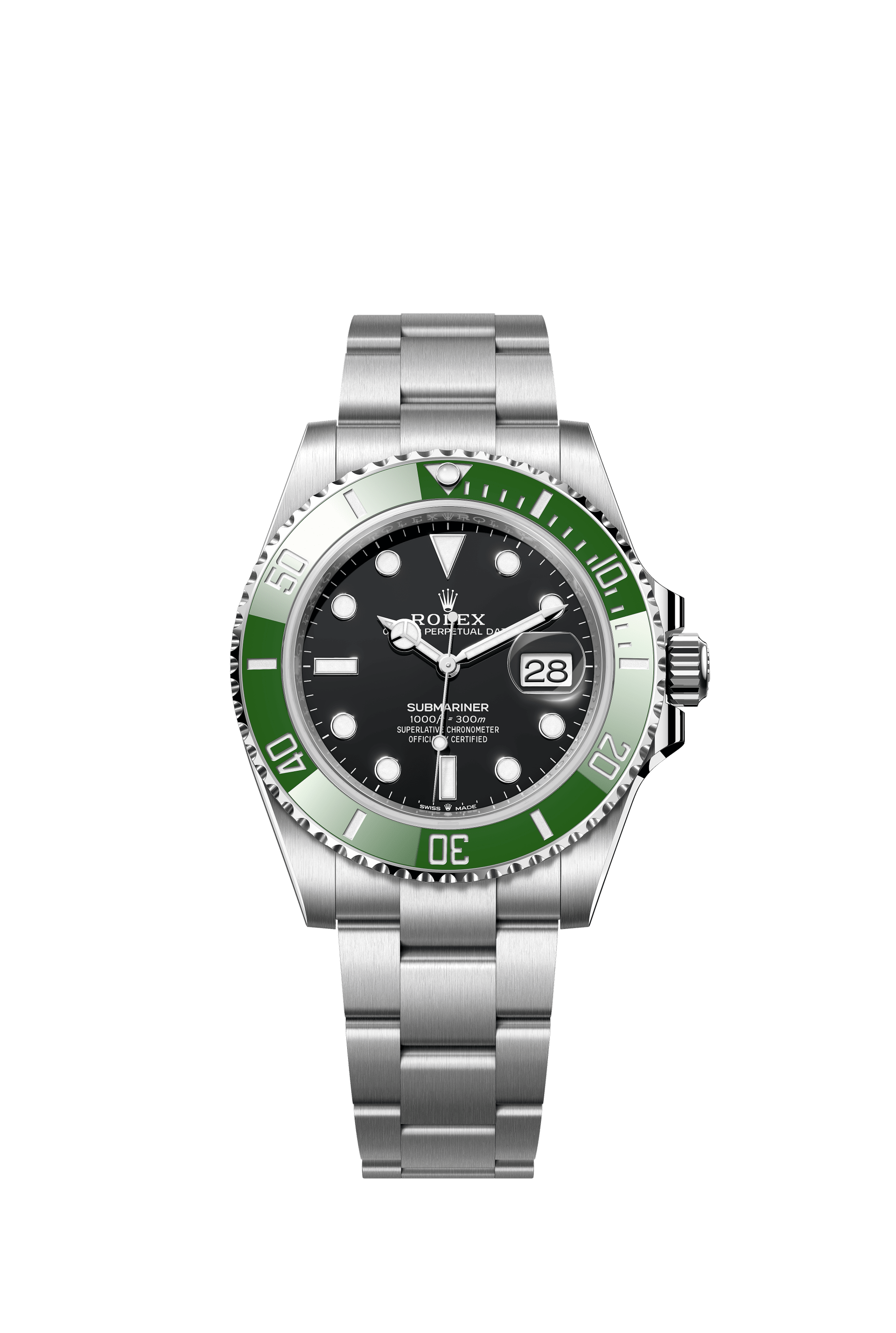
The Oyster case is the foundation. Originally a technical solution to protecting a movement from water and dust, the screw-down construction became a visual language of durability. The Submariner amplifies that message with its substantial timing bezel and luminous geometric markers. Circles, bars and a triangle quickly communicate orientation, even when the dial is glimpsed briefly. Here the graphic design is a direct product of functional demands.
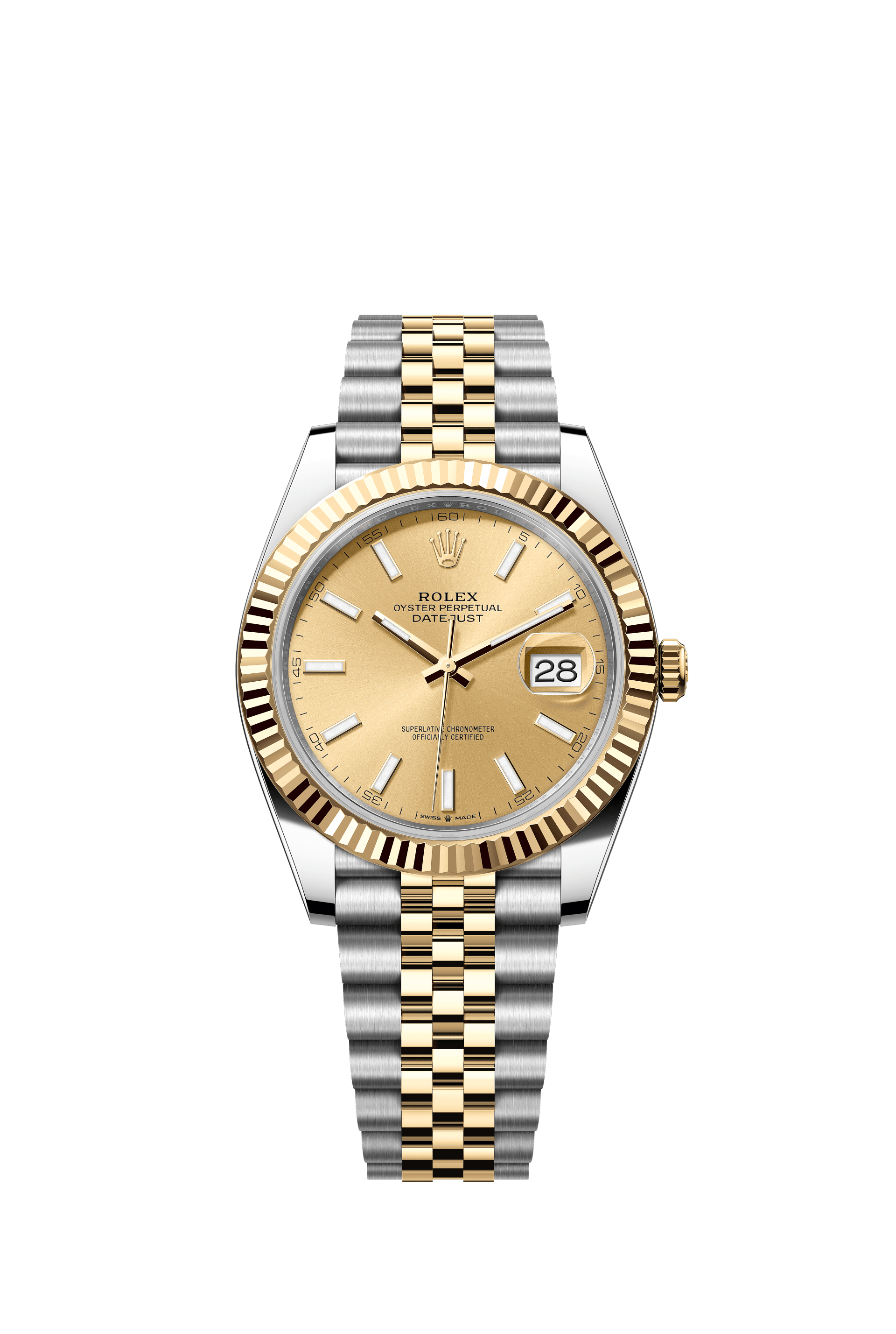
The Datejust translates the same design system into elegance. A fluted bezel reflects light in narrow flashes, the five-link Jubilee bracelet produces a finely articulated surface, and the Cyclops date lens creates a highly recognisable asymmetry. Once functional, the fluted profile has become a decorative signature. Rolex demonstrates how an engineering feature can accumulate cultural meaning over time.
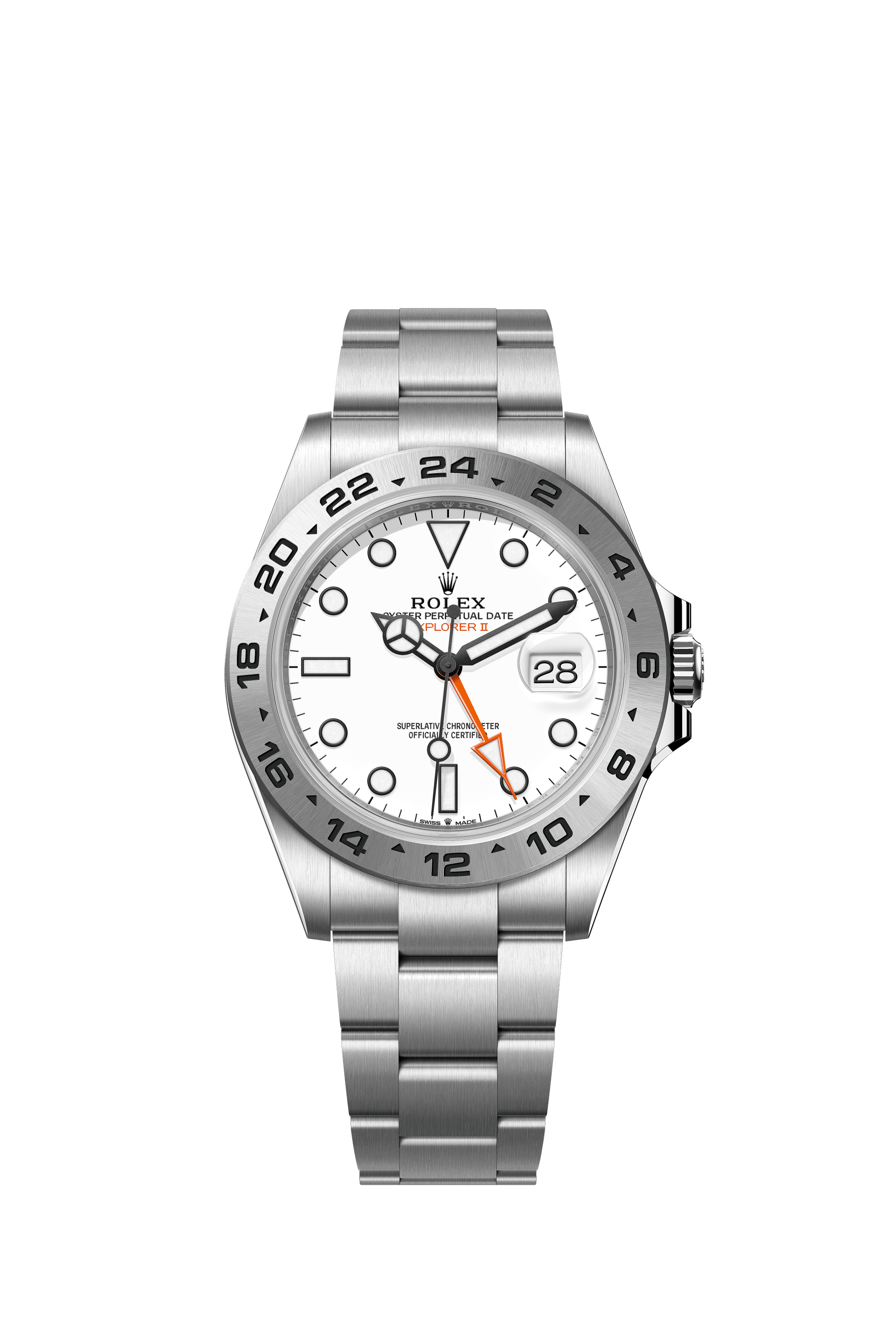
The Explorer family shows how much can be communicated with relatively few dial elements. The Explorer's black 3-6-9 display is spare by Rolex standards, while the Explorer II pictured here takes the idea toward navigation with a white dial, prominent orange 24-hour hand and fixed graduated bezel. Both balance a clear hierarchy with a strong purpose. The Explorer II is a reminder that legibility can be a form of visual character rather than merely a performance specification.
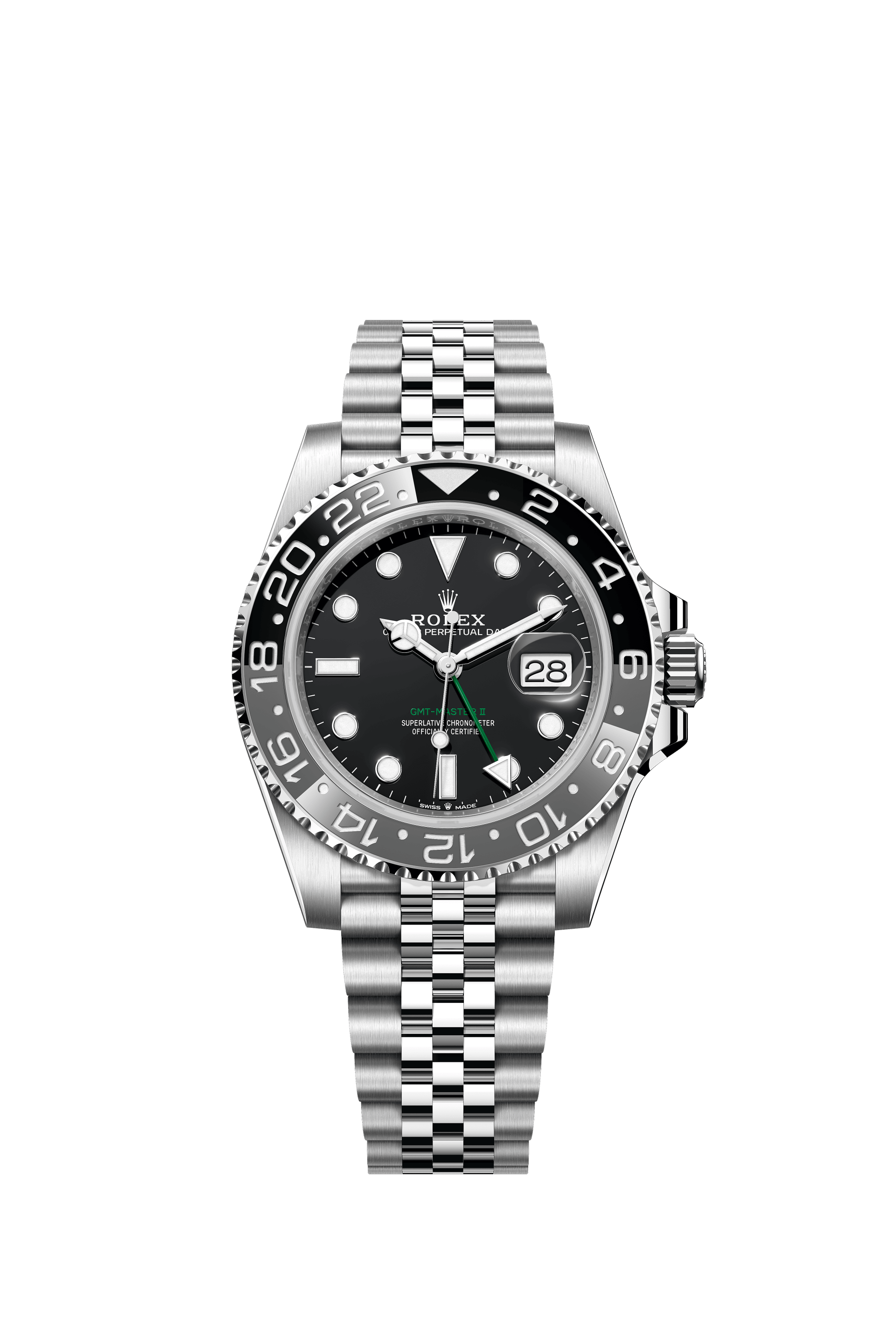
The GMT-Master II adds colour and information without abandoning that clarity. Its 24-hour bezel and independent local-hour hand are travel tools, but two-tone ceramic inserts have become central to the model's identity. The grey-and-black 126710GRNR demonstrates how even subdued colours can establish a distinctive character. Colour here is not just decoration; it helps define the instrument's purpose.
The Cosmograph Daytona faces the harder challenge of organising complexity. A chronograph needs pushers, counters, scales and additional hands. On the white-dial steel 126500LN, black counter rings give the dial a strong rhythm and the tachymeter sits on the ceramic bezel. The layout creates layers of information while retaining a coherent overall silhouette. Though it is discussed here, the Daytona is not among the four accompanying Rolex photographs.
Rolex bracelets are part of the visual identity, not accessories added at the end. The Oyster's broader three-piece links look architectural and sturdy, while the Jubilee's five-piece construction is softer and more intricate. Clasp systems and small comfort adjustments show why good industrial design must also anticipate everyday interaction. The watch succeeds only if the case and bracelet feel like one object on the wrist.
Materials intensify these distinctions. Oystersteel supports the practical ambitions of the professional collections; gold adds warmth and polish; ceramic keeps coloured bezel inserts resistant to abrasion and sunlight. Finish is just as important as material. Brushed planes suggest equipment, polished edges create highlights, and textured surfaces give the watch legibility at changing angles.
A remarkable aspect of this approach is the way model families remain distinct without ceasing to look related. The Submariner suggests immersion, the GMT-Master II travel, the Daytona motorsport and the Datejust everyday elegance. A recurring case architecture and shared graphic cues create continuity, but different bezels, dial arrangements and bracelets establish purpose.
This consistency is not without trade-offs. Designers who prioritise novelty may find Rolex predictable, and that criticism has merit. But incremental change can be difficult to execute: a fractionally broader lug, a slightly heavier marker or a revised bezel profile can upset an established balance. Preserving recognition while improving a product demands careful editing.
Rolex's broader lesson is that identity grows stronger through repetition when the repetitions are purposeful. The brand is not defined by one dramatic flourish but by thousands of decisions about proportion, contrast, typography, finish and ergonomics. Its watches have become cultural objects because their visual language has survived changing fashions.
Whether one personally prefers bold experimentation or this disciplined continuity, Rolex remains an extraordinary case study in product design. Its watches show how clear visual rules can support variety, how functional components can become symbols and how a deliberately familiar object can continue to feel relevant across generations.
Source & attribution
Rolex official collection and product pages · Published 2026-10-12 ↗
Related perspectives
The psychology of colour in modern watch design ↗