
Design · 2026-10-30
Designed to move: how watch finishes turn light into form
Polished edges, brushed planes and dark composites do more than decorate a watch. They determine how its shape appears as the wrist moves. A four-minute design essay.
By Chronolume digest · Original English summary · Based on Chronolume original editorial; research from Grand Seiko, Maurice Lacroix and Norqain
Save this watch to revisit later.
What to know
A watch changes before its hands have moved. Turn your wrist beneath a window and a broad steel flank becomes almost black; a narrow edge flashes white; a bracelet that looked solid a moment ago breaks into separate planes. The object has kept its dimensions, yet its apparent weight and outline have shifted. This is one of watch design’s most effective tools, and one of its least adequately described. A specification sheet can name the metal. It struggles to explain what the designer asks light to do with it.
Finishing belongs to the structure of the design. A mirror-polished surface reflects a relatively coherent image of its surroundings. Depending on its angle, that image might be a bright ceiling, a dark sleeve or the room beyond. Polished steel therefore does not simply look bright. It can disappear into darkness and return as a sharp highlight. Those changes make a case feel animated, even when its outline is restrained.
Brushing establishes a different rhythm. Fine surface lines break up reflections and give the metal a visible direction. A brushed top can make a lug read as a stable, continuous surface while its polished side changes dramatically. Put a narrow polished bevel between them and the transition becomes legible. The eye can follow the edge without needing to understand how the case was manufactured. That tiny border does a surprising amount of explanatory work.
The important decision is where one finish stops and another begins. A broad polished area can make a case feel expansive. A dark reflection across the same plane can make it seem thinner. A bevel may sharpen the outline or, if its width dominates, soften the impression of the form beneath it. There is no universal formula in which more polishing means more refinement. The relationship between neighbouring surfaces matters more than the amount of shine.
Grand Seiko makes this relationship unusually explicit. Its account of the 44GS, introduced in 1967, describes flat, mirror-polished surfaces and sharply defined junctions as foundations of a recognisable design language. Zaratsu polishing supports that geometry by preparing smooth surfaces while preserving crisp boundaries. The interesting lesson extends beyond the named technique: an exterior can acquire an identity through the way its planes collect light, without depending on a conspicuous decorative motif.
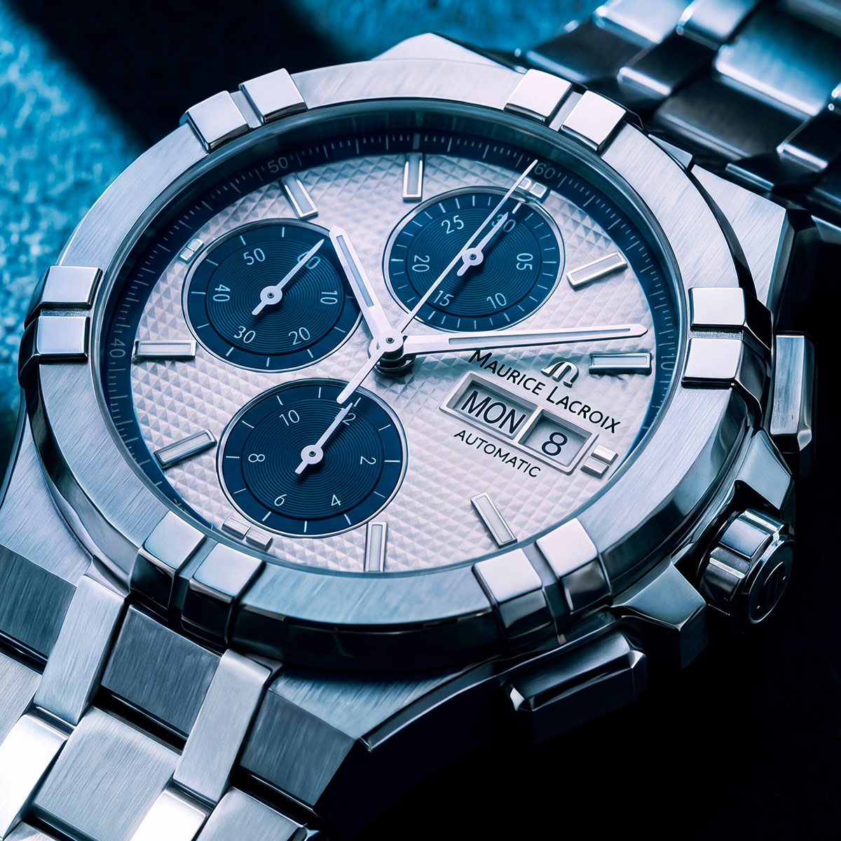
Maurice Lacroix’s latest AIKON Automatic Chronograph offers a more segmented expression. Its six-claw bezel, steel bracelet and alternating polished and satin-brushed surfaces divide the watch into a sequence of visual events. In the official photographs, the claws interrupt the circular bezel while the bracelet carries the changes in reflection away from the dial. Read this as a design observation: the watch’s coherence comes partly from repetition across separate components, rather than from a single uninterrupted contour.
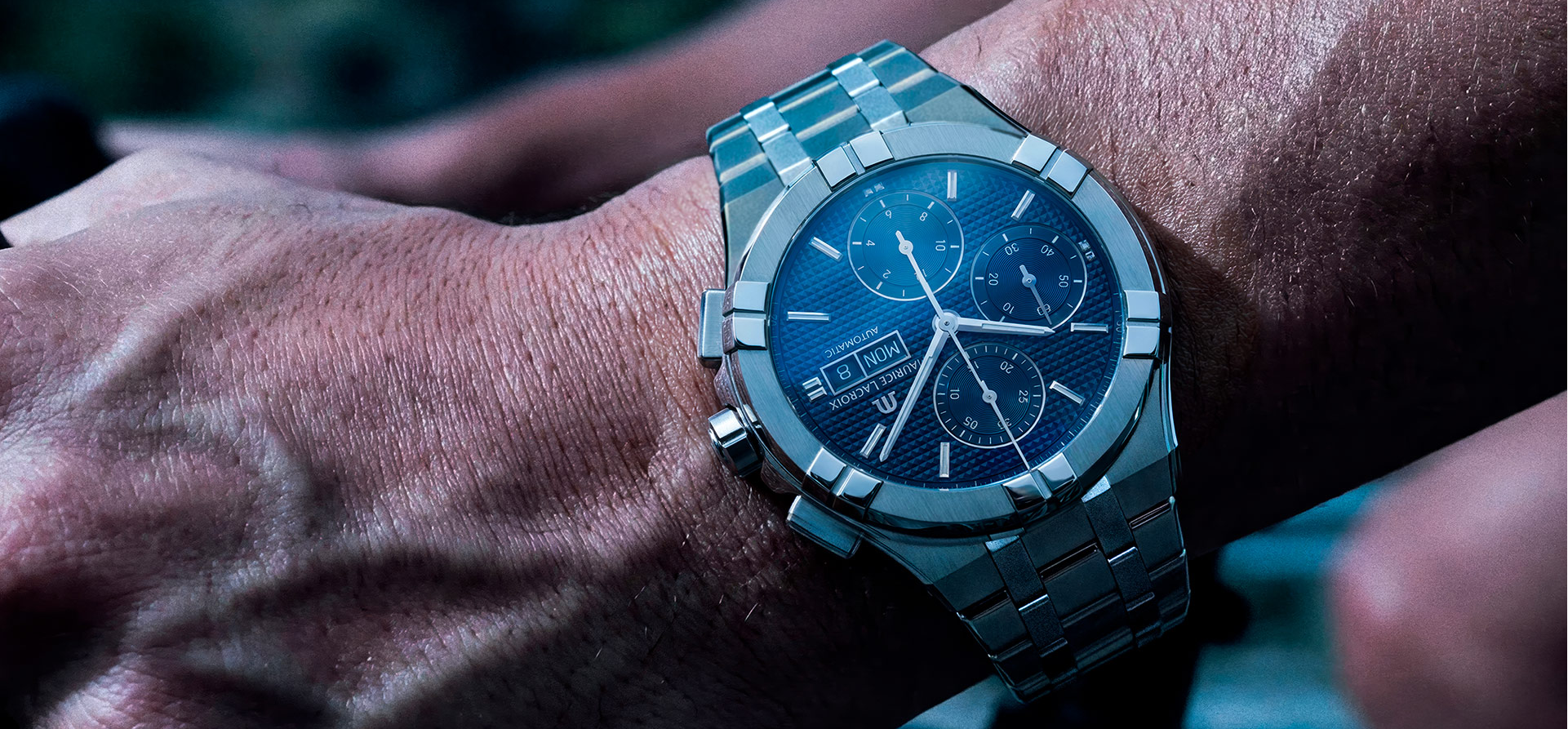
A bracelet makes the effect especially complex because its surfaces rarely occupy the same angle. As the wrist curves, individual links encounter the light differently. Repeated highlights can give even a substantial band a fluid appearance. Strong contrast between link sections can also make it feel busier and more jewellery-like. Neither effect follows automatically from price or construction. They are consequences of the surface pattern, the link geometry and the way the whole assembly articulates.
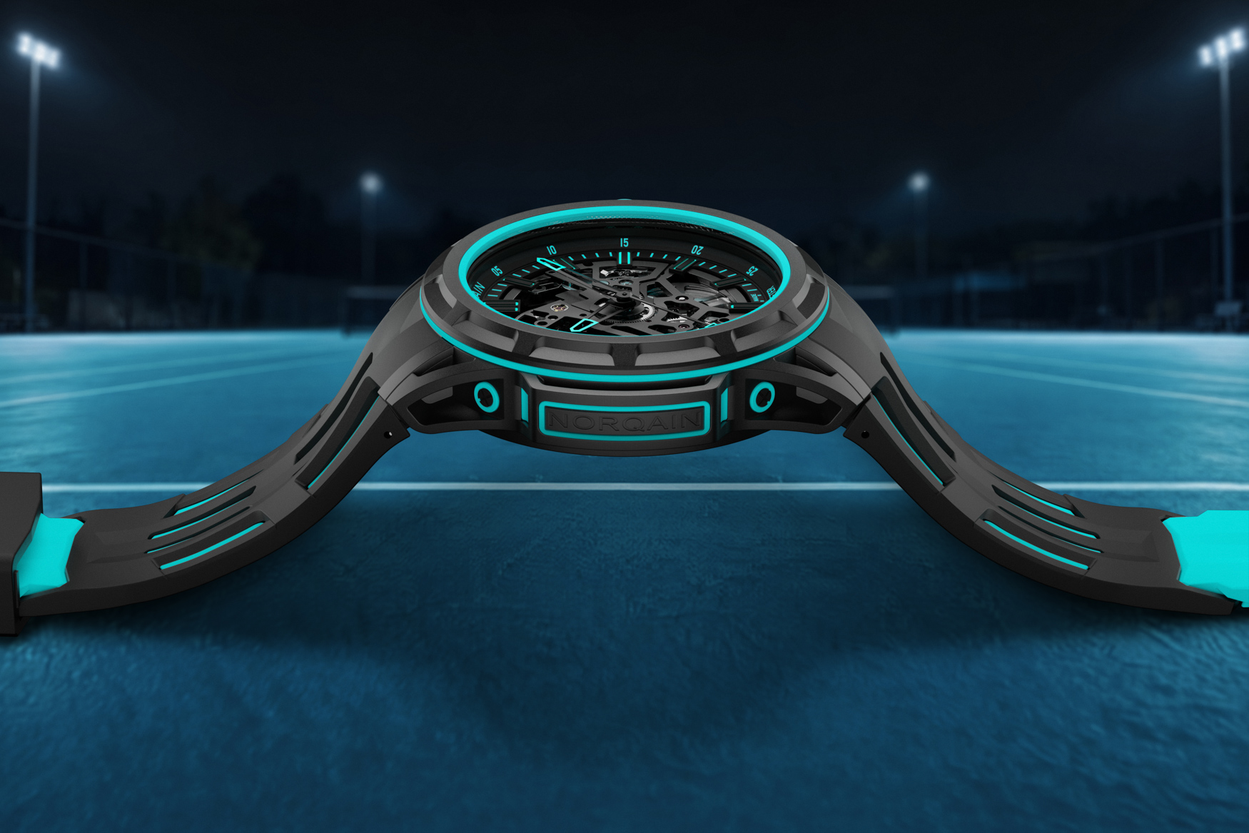
Norqain’s Wild ONE Skeleton X-Lite Turquoise approaches the problem with a predominantly dark exterior, contrasting coloured rubber and a layered mixture of composites and metal. Here the visual energy is less dependent on broad mirrored expanses. The turquoise interruptions help separate the case architecture from the openworked display. Set beside the AIKON, it demonstrates another way to keep a complicated object understandable: assign different visual roles to neighbouring materials, then let their boundaries describe the construction.
Photography inevitably edits these relationships. A soft light source can turn polished steel into a smooth, pale band; a darker setting can make the same area nearly vanish. Neither photograph needs to be dishonest. Each records one arrangement of the watch and its surroundings. This is why a single flattering image explains a colour more readily than it explains a case. A short sequence of changing angles can reveal decisions that a straight-on product portrait conceals.
The useful question is what remains coherent as the reflections move. Can you still distinguish the bezel from the mid-case? Do the lugs retain a clear direction? Does the bracelet continue the same visual rhythm? These questions turn finishing from a vague impression of luxury into something observable. A well-resolved watch offers more than an attractive frozen silhouette. Its surfaces keep explaining its shape while the wearer moves through an ordinary, changing world.
Share this article