Design · 2026-11-04
Breguet and Engineered Elegance: the design philosophy behind a watchmaking language
Why Breguet hands, numerals, guilloché and asymmetrical movement architecture still define a living design philosophy, from Classique and Tradition to Marine.
Chronolume · Source-based analysis · Research checked 2026-11-04

Save this watch to revisit later.
Desk-based visual comparison of three product families and Breguet's own history; sources are manufacturer materials and previously sourced images. No hands-on access, tests or interviews.
The analysis
Breguet has one of the rarest forms of brand recognition: you can identify its design without seeing a logo. Slender open-tipped hands, carefully lettered numerals, discreetly textured metal and an exacting relationship between a dial’s different zones create a visual grammar that has survived more than two centuries. Its remarkable strength is not any single ornament but the way those parts cooperate.
Abraham-Louis Breguet’s legacy is often framed through inventions: the tourbillon, advances in automatic winding, the pare-chute shock protector and extraordinary precision instruments. Yet there is a second kind of innovation in his work, equally important to design history. He treated the watch as an interface. The challenge was not simply to make a mechanism perform, but to let a person read it cleanly and confidently.
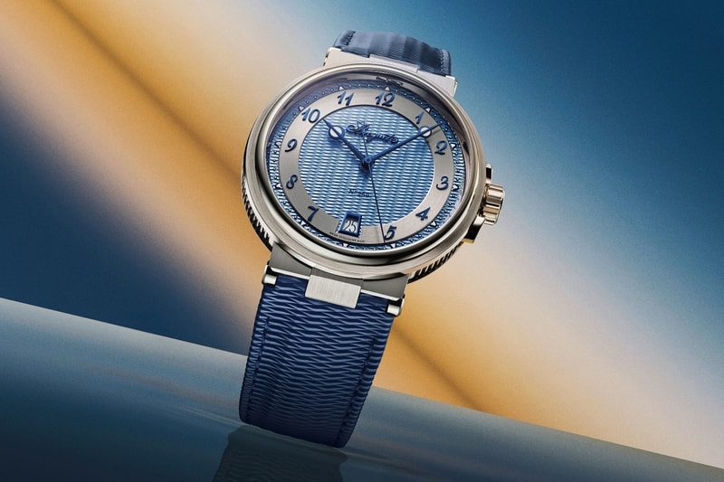
The most recognizable Breguet hands are an excellent example. The thin stems end in an open, eccentric circle, sometimes called the hollow 'pomme'. The circle lends the pointer a visual terminus without adding the weight of a broad arrow. When finished in blue steel and placed against a restrained dial, it forms a delicate but precise contrast. The solution looks decorative today, but much of its elegance comes from controlling how much material is used.
Likewise, the familiar Breguet numerals avoid the authority of dense Roman figures. Their distinctive loops, curvature and spacing establish a lightness that can feel almost handwritten. The typography is not neutral. It suggests cultivated precision, and on a circular dial it offers a particularly refined rhythm. Breguet dates the origin of its signature numerals to 1783, an indication of how deeply its visual identity is rooted in the founder’s era.
Guilloché completes the system. In the late eighteenth century Breguet introduced machine-turned geometric patterns onto watch dials. This was more than surface decoration. Fine textures reduce the severity of reflections and separate functional zones. Different patterns can distinguish the chapter ring, small seconds, reserve indication and central field without forcing the designer to draw thick dividers or introduce additional colours. Surface becomes hierarchy.
This matters because it expresses a principle still valuable in interface design: information can be structured by differences of material, rhythm and light, not only by printed lines and labels. A guilloché dial is not simply more intricate than a flat one. At its best, the craftsmanship is an invisible organizing system that improves the reading experience.
The Classique collection is the most direct continuation of this thinking. A narrow bezel, balanced proportions, fluted caseband, open-tipped hands and dial textures build a watch that feels precise rather than visually loud. Even when it includes a tourbillon, the design seeks composure. The new 35mm Classique Tourbillon 7357 demonstrates the point: its hand-wound calibre 187B and tourbillon are significant, but the aesthetic works because the complication has a place inside a carefully controlled composition.

Tradition turns the same philosophy inside out. It takes inspiration from historical souscription and tact watches, then exposes the machinery on the dial side. The dial remains a small, disciplined space, floating over a network of bridges and wheels. The 2026 Tradition 7037 and GMT 7067 make a particularly interesting comparison. One gives the viewer a relatively simple time display with retrograde seconds; the other adds another time zone without abandoning the exposed structure.
This creates a subtle inversion of the usual luxury-watch visual hierarchy. On a conventional dress watch, mechanics are hidden while the dial announces refinement. On a Tradition, the calibre becomes architecture and the actual time display becomes a contained graphic object. The risk is visual overload, but the success depends on familiar Breguet principles: purposeful asymmetry, regularity, and enough contrast for the information to remain legible.
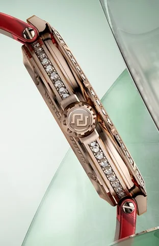
The latest Tradition 7038 pushes the argument further, juxtaposing diamonds, aventurine glass and finely finished mechanical parts. It makes clear that Breguet is not dogmatically minimalist. The brand is prepared to explore jewellery and spectacle, but the most effective details are those that still clarify the relationship between the exposed mechanism and the time dial. Decorative complexity needs a visual reason to exist.
Marine takes the Breguet alphabet into a less forgiving environment. Sports-watch cases are thicker and more assertive, with guards, angular lugs and substantial water resistance. The redesigned 2026 Marine 5517 and Marine Chronographe 5527 use the Quai de l’Horloge guilloché pattern and Breguet numerals to bring a distinctive classical tone back to the surface. Moving the date to six o’clock improves balance; the chronograph’s two-register layout makes the timing information easier to organize.
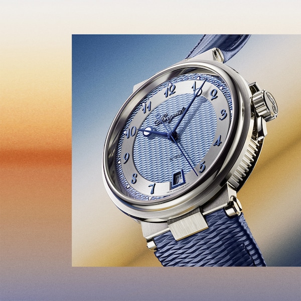
Not every historical signature translates seamlessly. The intricacy of a hand-guilloché dial can work against the glance-read quality expected of a modern sports watch, particularly under strong light. The more facets a case contains, the more that restraint matters. But this friction is precisely why Marine is worth watching: it tests whether a language designed around elegance and precision can become dynamic and robust without becoming generic.
The Reine de Naples collection shows another kind of flexibility. Its egg-shaped case challenges the assumption that Breguet's identity depends on roundness. Off-centred indications, asymmetry and precious materials can still be read as recognizably Breguet because the design language lives in the proportions, graphic refinement and relationships between mechanical and decorative elements, not in one silhouette.
The larger lesson is that a durable design philosophy must be capable of both consistency and translation. Open-tipped hands and guilloché remain prominent, but they are not merely nostalgic assets. They are part of a system for choosing where to place emphasis, how to structure a face and how much information a viewer should absorb at a glance. The 2026 releases are interesting when they refresh that system, rather than treating historical details as untouchable.
Breguet’s strongest watches suggest that the finest ornament is rarely arbitrary. A pattern can make a dial readable. A hand can be elegant because its outline is more precise. A mechanism can be displayed because its geometry tells a story about construction. In that sense, Breguet is not only a historic watchmaker. It offers a continuing proposition about design: technical intelligence and visual refinement become more powerful when they are developed as one discipline.
Share this article
Sources & research
Research checked 2026-11-04. Specifications are manufacturer figures; interpretation and calculations are identified in the text.
- https://www.breguet.com/en/breguet-house/1775-1801/appearance-guilloche-watchmaking
- https://www.breguet.com/en/watches/classique
- https://www.breguet.com/en/watches/tradition
- https://www.breguet.com/en/watches/marine
- https://www.breguet.com/en/news/breguet-continues-tradition-story