
Design · 2026-10-11
Beyond stainless steel: how materials shape a watch’s personality
Ceramic, titanium, carbon and sapphire change how a watch handles light and texture.
Save this watch to revisit later.
Share this article
By Chronolume digest · Original English summary · Based on Chronolume original analysis; illustrated with Studio Underd0g
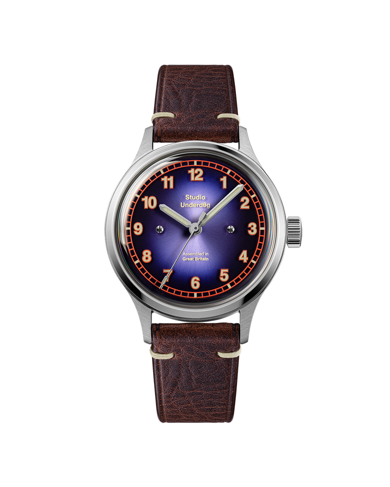
What to know
Stainless steel dominates contemporary watchmaking, but the language of a watch changes dramatically when designers work with titanium, ceramic, sapphire or carbon composites. Materials influence weight and durability, certainly, yet their most immediate contribution is often visual. They determine how a case reflects light, how a dial feels and how an object communicates its character.
Brushed steel has a reassuring familiarity. Its fine directional texture reduces reflections and makes surfaces appear practical. Polished steel behaves almost like a mirror, emphasizing curves and crisp edges. Combining the two can make a relatively simple case look architectural: brushed planes become quiet backgrounds for narrow highlighted facets.
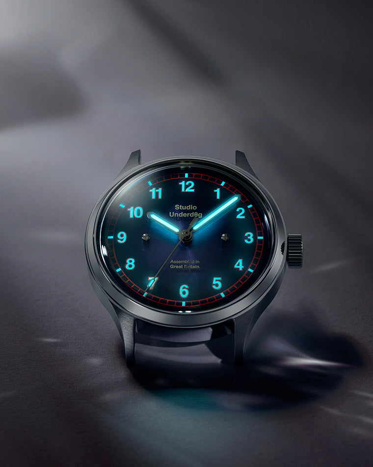
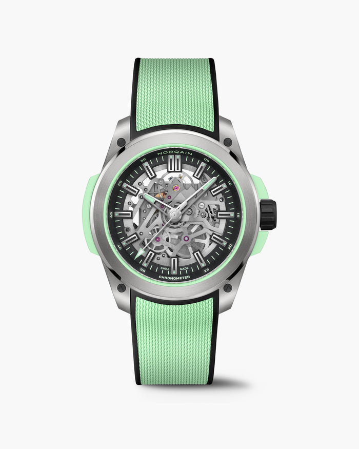
Titanium is frequently chosen for its strength-to-weight advantages, but its grey tone also creates a different atmosphere. Ceramic offers another vocabulary, with saturated colour and a smooth, hard surface. Carbon composites can produce irregular, layered patterns that make successive examples appear slightly different. None of these materials is automatically superior; each asks for a different design approach.
Transparency introduces a less obvious material effect. A sapphire component can create visual depth by separating printed information from the surface beneath it. In the Studio Underd0g Nightshade, a tinted sapphire layer sits above a textured dial, producing subtle shifts in reflection and shadow. The dial feels deeper not because it contains more decorations, but because it contains more spatial relationships.
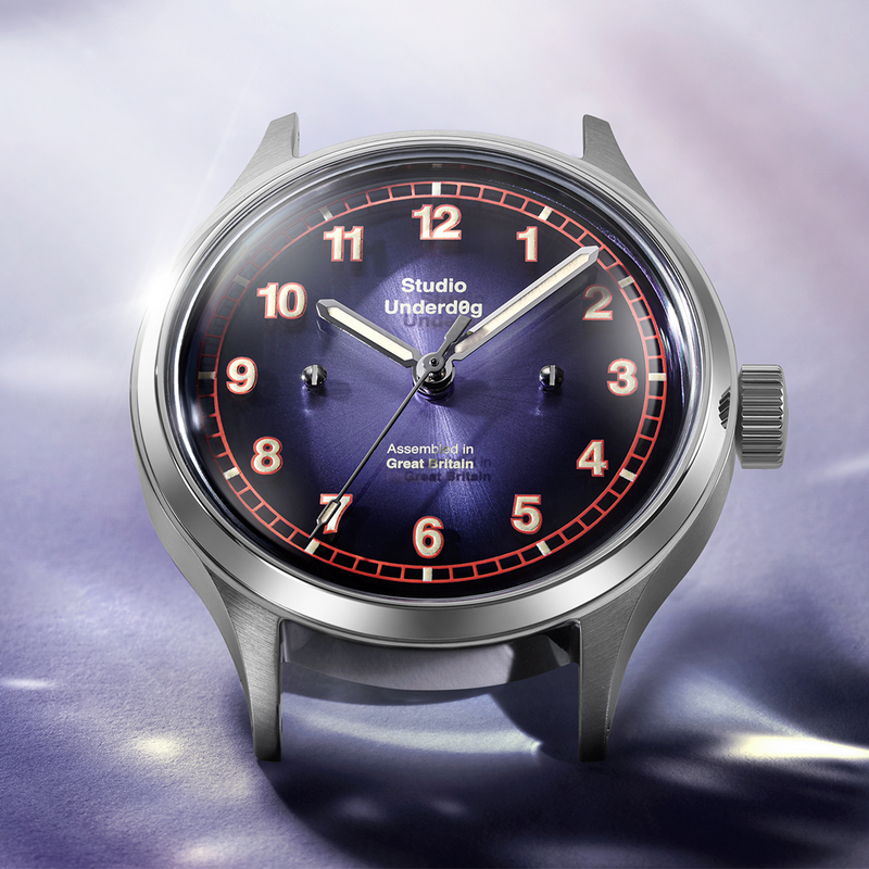

Finishing matters as much as material selection. A rough texture can emphasize utility; a finely polished bevel signals precision. The direction of brushing can visually lengthen a lug or reduce the apparent width of a case. Designers use those optical effects with the same care that architects apply to stone, glass and metal.
For collectors, this suggests a richer way to evaluate a watch. Move it slowly under changing light, examine the transition between surfaces and consider whether the materials serve the concept. A compelling watch does not need exotic substances, but when material and form reinforce one another, the result can feel unusually complete.

Source & attribution
Chronolume original analysis; illustrated with Studio Underd0g · Published 2026-10-11 ↗
Related perspectives
The Rolex design language: why evolution beats reinvention ↗