
Design · 2026-11-01
A different script, a different rhythm: the design of Arabic dials
Eight watches reveal how Eastern Arabic numerals reshape spacing, colour and identity—from compact Seiko automatics and Orient Bambinos to MING’s worldtimer and a counter-clockwise Hublot.
By Chronolume digest · Original English summary · Based on Chronolume original design essay, with manufacturer and typography references

Save this watch to revisit later.
What to know
Change the numerals on a watch and the mechanism can remain untouched while the whole object seems to change its voice. The case is familiar. The hands still make their accustomed journey. Yet the dial asks to be looked at again. Eight watches newly added to Chronolume show how much character can live inside the shapes used to mark twelve hours.
A little precision helps before looking closer. In watch collecting, “Arabic dial” often means the ٠١٢٣٤٥٦٧٨٩ forms commonly used with Arabic script. Unicode calls these Arabic-Indic digits; collectors frequently call them Eastern Arabic numerals. The 0123456789 forms are also known as Arabic numerals, so the label alone can be ambiguous. Regional usage varies, and Unicode distinguishes another set called Eastern Arabic-Indic, used with languages including Persian and Urdu.
The distinction matters because a numeral is information before it is decoration. A reader familiar with these figures may recognise them instantly; another reader may first notice their curves and angles. Neither response defines the quality of the design. A good dial should be judged by the coherence of its shapes and the clarity of its hierarchy, while acknowledging that familiarity changes the experience of reading it.
Start with the two black-dial Seiko 5 references, SNK063J5 and SNKP21J1. They make an effective comparison because the concept is similar but the scale differs: the compact watch measures 34 mm, the larger one 42 mm. Pale numerals gather around dark centres, with day-date windows interrupting the rings at three. Each remains an unpretentious everyday automatic, with typography doing much of the visual work.

Look at the compact Seiko and the figures feel closely gathered around the hands. On the larger reference, they occupy a broader field. That difference changes the apparent density of the face even before case size is considered on the wrist. It illustrates why enlarging a watch involves more than multiplying dimensions. The distance between a numeral, its neighbours and the minute track is part of the design.

Spacing is particularly revealing around ten, eleven and twelve. A two-character hour indication has a different footprint from a single-character one, and the dial has no extra circumference to offer it. The designer must decide how much space to preserve around the group and how strongly it should stand out. Matching the apparent weight of the hours matters more than giving every figure an identical bounding box.
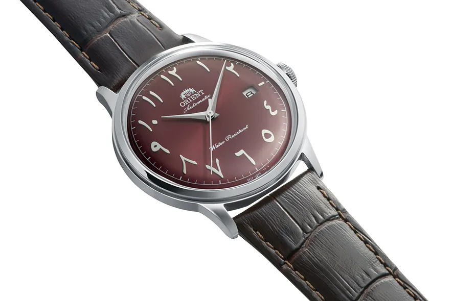
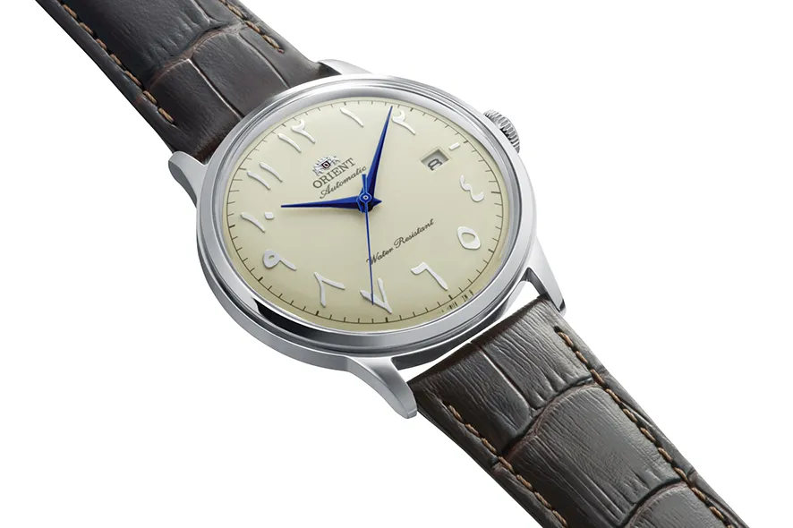
Orient’s Bambino takes the same broad idea into a more formal setting. The navy RA-AC0036L, Bordeaux RA-AC0037R and ivory RA-AC0039Y share a 40.5 mm case and domed crystal. Their fine minute tracks, slender hands and Eastern Arabic hour numerals make a useful three-colour study. The underlying structure stays recognisable while the mood shifts between cool, warm and traditional.
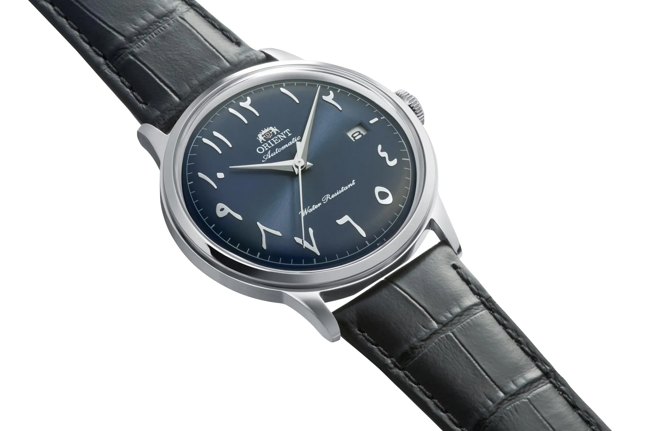
The ivory version is especially instructive. Its pale ground allows the numeral shapes and blue hands to register separately. In navy and Bordeaux, the light figures instead gather into a brighter perimeter. These are different relationships between background and information. A colour change can strengthen a numeral’s outline, soften it, or make it appear to hover above the dial. Typography never operates independently of the surface beneath it.
D1 Milano’s Jade Mirage uses a different degree of emphasis. Applied Arabic-Indic figures share an olive-green sunray dial with conventional markers, surrounded by a champagne-toned integrated exterior. The two-hand layout leaves the face comparatively quiet. Here, the figures work as selected points of identity within an established shape, demonstrating that a complete ring of twelve numerals is not necessary for a script to influence the design.

The material treatment makes another difference. A printed numeral can read as a crisp patch of colour. An applied one is a tiny object with edges, thickness and reflections. On a moving wrist, its visibility can change as it catches light. Choosing between printing and application therefore changes more than perceived luxury: it changes how stable the contrast remains and how the lettering belongs to the surrounding metalwork.
MING’s 29.01 Dubai Edition extends the question beyond the hour ring. Its world-time display includes Arabic city names as well as numbers, carried across sapphire layers above a 24-hour disc. Luminous material makes the writing part of the night-time interface too. This is a particularly rich example because the regional adaptation reaches the information the complication actually needs, rather than stopping at a few decorative markers.

A worldtimer makes language impossible to treat as an afterthought. City names have lengths, shapes and intervals that must coexist with the scales beside them. A successful translation may require a fresh arrangement of the information, not a direct replacement of one label by another. MING’s layered construction gives that writing depth; the more important design question is whether each layer remains distinguishable when everything is seen together.
Hublot’s 42 mm Classic Fusion Titanium Seddiqi 75th Anniversary goes further in another direction. Burgundy, Eastern Arabic figures and an anniversary emblem establish its regional identity, but the hands also travel counter-clockwise. The numeral arrangement follows that choice. The familiar circular act of reading time is deliberately reorganised, creating a more substantial change than replacing the printed characters alone.
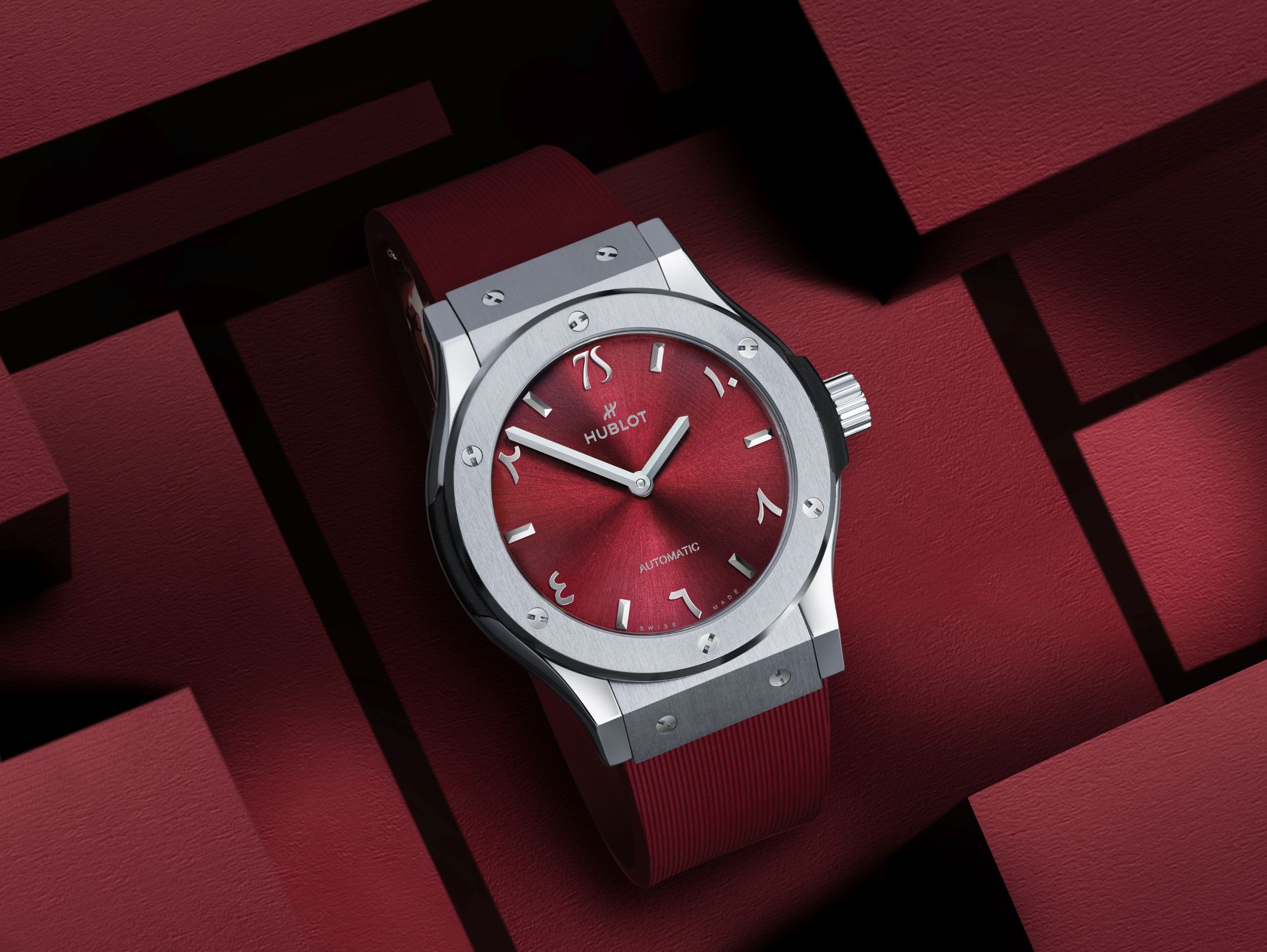
It would be a mistake to treat reversed hands as a requirement of an Arabic dial. The other watches here retain conventional clockwise timekeeping. Nor does the direction of a written language dictate how every associated instrument must behave. Hublot’s reversal is a particular commemorative gesture. Its interest lies in how thoroughly the dial and mechanism commit to that gesture, and in the new reading habit it asks of its owner.
These examples also suggest a better vocabulary for discussing regional editions. Calling a script “exotic” makes the observer’s unfamiliarity the centre of the story. Describing its actual design is more revealing: the open space around a figure, the thickness of its strokes, the relationship between numerals and hands, or the contrast between a date window and the hour ring. Those observations remain useful whether the reader grew up with the script or learned it yesterday.
The next time an Arabic dial catches your attention, follow those relationships before reaching for rarity or price. Do the hands remain distinct as they pass over the figures? Does the minute scale support the hours or compete with them? Has the date been considered as carefully as the larger lettering? Eight very different watches can ask the same questions. Their best answers make the script feel fully at home on the dial.
Share this article