
Design · 2026-11-01
The pleasure of imbalance: why off-centre watch dials feel so right
A five-minute weekend essay on visual weight, empty space and the art of making unequal things feel balanced—from Glashütte Original and Ressence to a new analog G-SHOCK.
By Chronolume digest · Original English summary · Based on Chronolume original design essay; manufacturer references and credited photography

Save this watch to revisit later.
What to know
Put a watch on the table and, before reading the time, notice where your eyes go. Perhaps they land on a large date, a circle that sits slightly too far to the left, or a patch of dial that appears to contain nothing at all. That first movement of attention is part of the design. The most interesting watch faces do more than organise information. They organise the way we look.
Symmetry offers an obvious starting point. A circle, twelve evenly spaced markers and two central hands form an arrangement so familiar that we barely register its sophistication. Move one element away from the centre and the whole composition becomes a negotiation. Something else must answer it: another display, a stronger contrast, a larger area of quiet. The pleasure comes when unequal things somehow settle.
This is where balance becomes more useful than symmetry. A small white date against a dark dial can command as much attention as a much larger register. A polished edge can pull the eye harder than a broad matte surface. Size, contrast, texture and position all contribute visual weight. No formula guarantees that they will agree. Looking closely is how we find out whether they do.
Glashütte Original’s PanoMaticLunar Anniversary Edition makes an unusually clear lesson. The hours and minutes occupy the left side, with small seconds beneath them. The Panorama Date sits to the right, below a moon phase near two o’clock. None of these elements mirrors another. Yet their positions establish a legible route across the face, with the time given a room of its own.
In this platinum edition, blue aventurine glass adds a field of tiny reflections around the displays. The date reads as a bright rectangular interruption; the moon offers a softer point of light above it. The layout makes those very different shapes feel related. Notice how the space between them allows each to retain its identity. Filling that space with more text would change the character of the entire watch.

Empty dial area is therefore active material. It separates tasks, establishes pace and gives an important feature somewhere to stand out. On a small object, the temptation to fill every gap is understandable: a logo here, another line of specification there. Restraint requires confidence that an interval can do useful work. Think of the pause between musical phrases, or a generous margin beside a column of print.
Ressence takes a different approach with the TYPE 11 Latte. Its convex titanium dial carries three eccentric satellites within an orbital display. Hours, seconds and a power reserve indication share the surface with the minutes. Instead of conventional hands suspended over a stationary face, the indications belong to rotating discs. The composition changes as time passes, making a single photograph only one moment in its design.
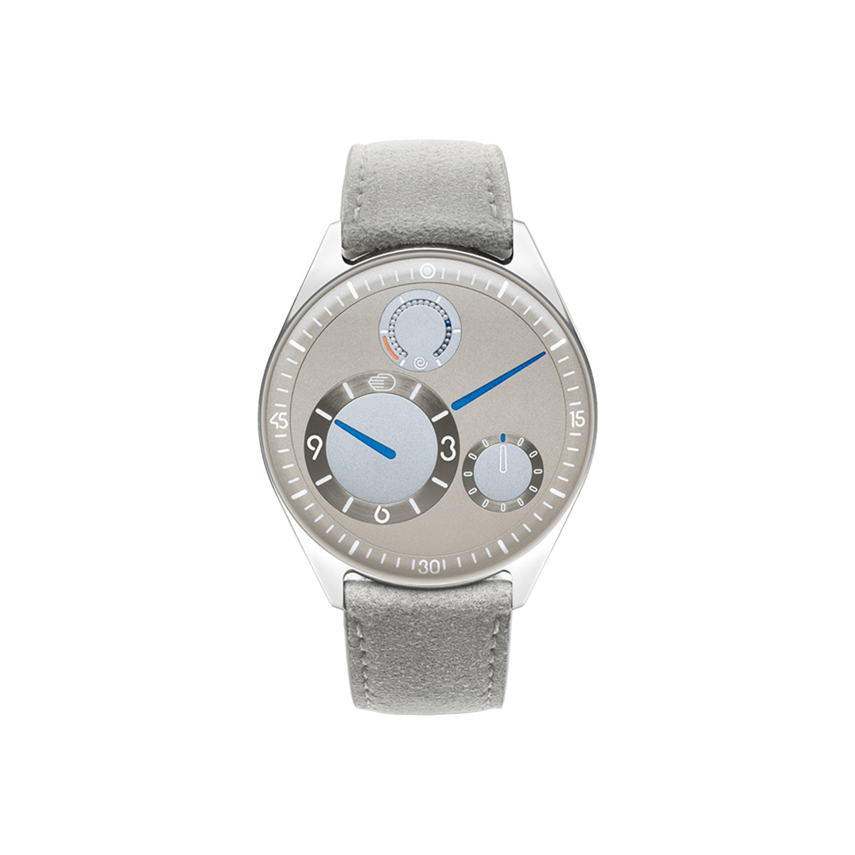
The visual challenge is continuity. How can a face remain recognisable while its parts change position? In the Latte, a restrained palette, repeated circular forms and blue indications provide the common language. The eye can identify related components even when they move apart. This is an interpretation of the design, rather than a claim that every unfamiliar display becomes effortless immediately. Learning a watch can be part of enjoying it.
Trilobe’s Château Trente-Deux offers another way to loosen the dial’s hierarchy. Hours, minutes and seconds are read from rotating rings against fixed pointers. Their unequal circles gather toward the left, leaving a broad sweep of burgundy on the right. The conventional central crossing of hands disappears. In its place is a set of relationships between moving scales, markers and the surrounding surface.
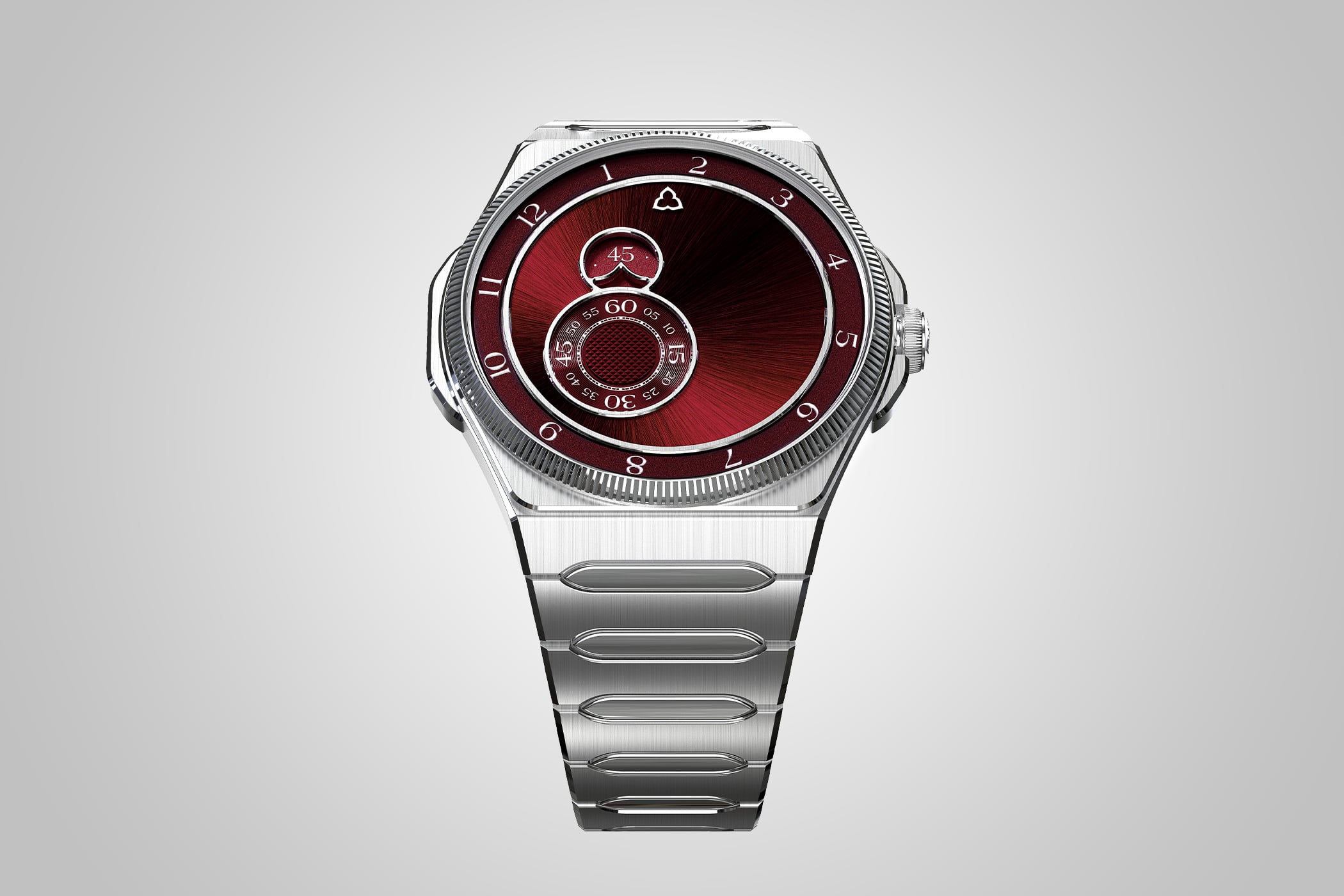
That burgundy area matters as much as the mechanism. It gives the smaller displays breathing room and allows their outlines to register before their numbers do. Seen from a distance, the watch is an arrangement of circles. Seen closer, it becomes a system to read. Good dial design can work at both distances, offering a strong overall shape and then rewarding attention with finer information.
Otsuka Lotec’s No. 6 questions a different convention: why must hands begin in the middle? Its coaxial hour and minute hands pivot low on the dial and sweep across a fan-shaped display before returning to their starting positions. A seconds disc and date occupy smaller openings. The result recalls a measuring instrument, with the information concentrated above the pivot rather than distributed around a central axis.

Here, the quieter lower portion makes the upper scales feel purposeful. Straight graining, visible fasteners and fine printed divisions support the instrument character. The lesson is not that exposed screws automatically make something honest or functional. Every detail still has to belong to the same argument. On the No. 6, the unusual hand position gives the rest of the design a convincing reason to exist.
Casio’s GMC-2500D-1A brings this conversation into a very different kind of watch. The new analog G-SHOCK puts a small-seconds display on the left and a three-cell Multi-Mission Date window on the right. A circle and a narrow curved opening face one another across the central hands. They are unequal, but their opposition gives the black dial a recognisable structure.
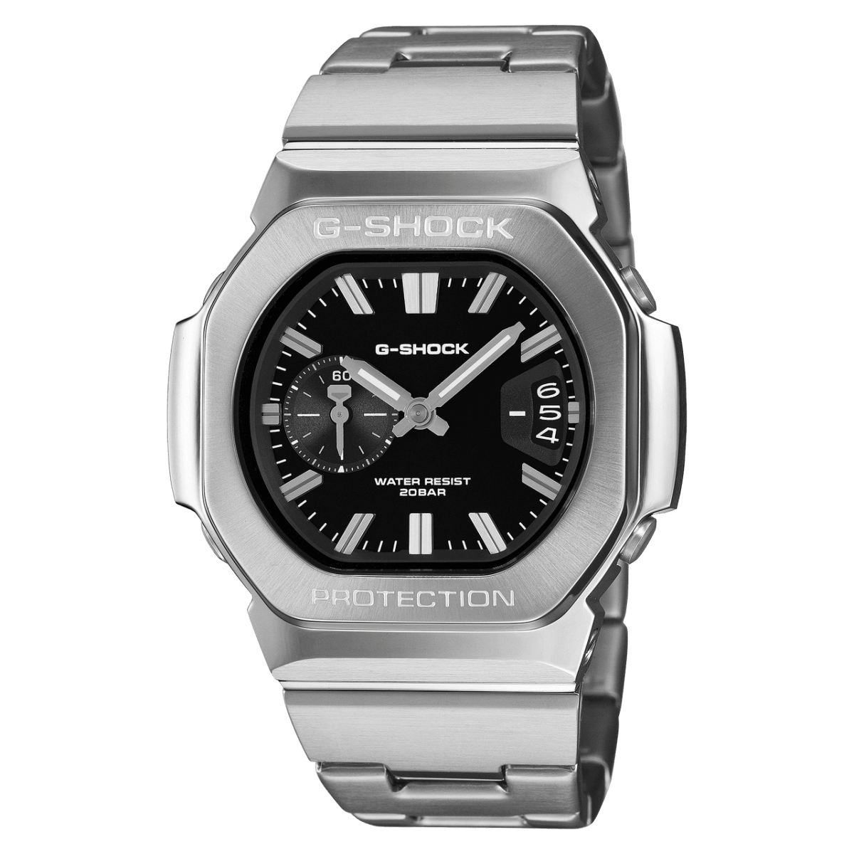
The steel bezel and bracelet provide a strong outer frame, while the repeated bars of the hands and indexes hold the interior together. This is a useful reminder that asymmetry need not announce itself as experimental watchmaking. It can emerge from the practical problem of putting different functions on one face. The design succeeds when those differences become intelligible, rather than merely conspicuous.
There is a limit to all this freedom. A dial can become so eager to surprise that reading it feels like resolving a puzzle every morning. Repetition helps: consistent markers, related line weights, a clear contrast between the main time display and secondary functions. Surprise needs something stable beside it. Otherwise an interesting first glance has little chance of becoming a satisfying long acquaintance.
A useful weekend exercise is to look at the watch you already own from three distances. First, let it become a blur and notice the largest shapes. Then bring it to an ordinary reading distance and see what arrives first. Finally, look closely at the gaps: around the logo, beside the date, between a hand and a marker. Those spaces reveal decisions that specifications cannot describe.
The reward is a different way of collecting, even if nothing is bought. A seemingly awkward dial may begin to make sense; a perfectly tidy one may reveal an interruption you cannot stop seeing. The next time an off-centre watch catches your attention, resist correcting it in your imagination. Give it a moment. What first looked misplaced may be the very thing that keeps you looking.
Share this article