
Design · 2026-10-28
Orange, six ways: how watchmakers make a difficult colour feel deliberate
From a single dial accent to a ceramic case and a grinning moonphase, six watches show why orange can be function, material and personality.
By Chronolume digest · Original English summary · Based on CNA Luxury; manufacturer product pages linked in text

Save this watch to revisit later.
What to know
Orange is not one design decision. On a watch, its effect depends on where it sits, how much surface it occupies and what surrounds it. A dark dial can use orange as a pointer; a bright case makes it the whole object. CNA Luxury’s 28 October 2026 selection provides six useful examples, ranging from dive instruments to an irreverent one-off. These are not six launches from today: Konstantin Chaykin’s Pumpkin Head dates to 2017, and the other models have their own product histories.
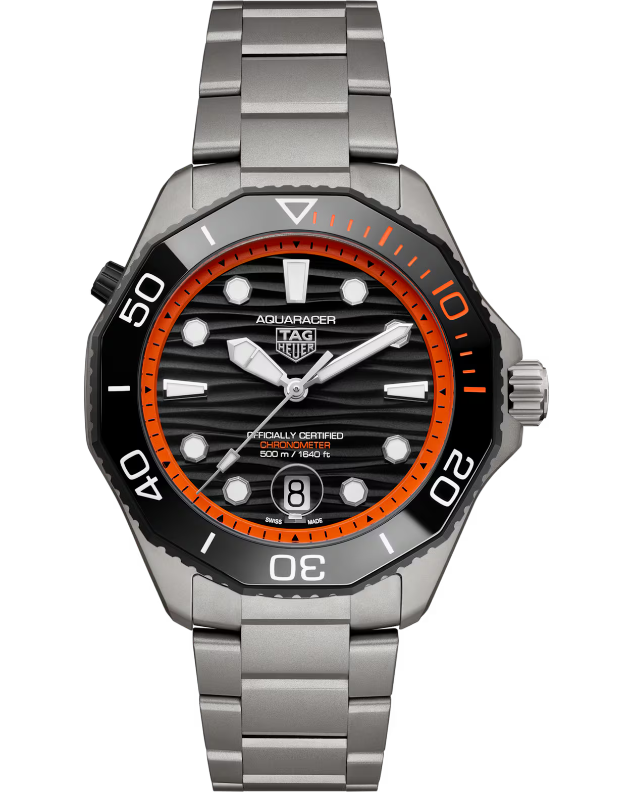
At the restrained end, the TAG Heuer Aquaracer Professional 500 Date uses an orange flange and a short bezel segment against black. The colour gives the eye landmarks without competing with luminous hands or the date. The Breitling Endurance Pro 44 spreads orange over its rubber strap, crown and scales. Its lightweight Breitlight case and SuperQuartz chronograph are built around activity; the colour makes that intention visible.
The Hermès H08 Chronographe moves orange outside the dial. Its strap frames a dark carbon-composite case with a softened-square outline, so a bold colour sharpens rather than obscures the H08 geometry. The orange Omega Seamaster Planet Ocean 600M, already covered on Chronolume, puts the colour on the bezel and strap: a strong border around a black dial. That existing article covers the same fourth-generation orange Planet Ocean event; another near-identical watch post would confuse the collection.


At the other extreme, Hublot’s Spirit of Big Bang Orange Ceramic turns the case and bezel orange. The skeletonised chronograph beneath the sapphire dial keeps the material experiment in dialogue with mechanics. Konstantin Chaykin’s Pumpkin Head abandons the usual sports-watch rationale entirely. Orange becomes a character, its triangular time displays and moonphase mouth forming a jack-o’-lantern. This unique 2017 piece shows how colour can carry a concept rather than merely improve visibility.


The lesson is proportion, not a universal rule about orange. Small highlights can create hierarchy; straps create a removable frame; coloured ceramic gives an entire case an identity; a figurative dial turns colour into narrative. Each approach needs an anchor—black negative space, a legible display, a clear case silhouette or a distinctive mechanism. Without that anchor, orange is loud. With one, it becomes a design argument.
Share this article
Source & attribution
CNA Luxury; manufacturer product pages linked in text · Published 2026-10-28 ↗