
Design · 2026-08-06
One colour, six identities: the design thinking behind Seiko’s Edo-purple anniversary watches
From an Alpinist compass ring to the Rotocall’s rotary switch, Seiko shows how a single historic colour can unite six contrasting watch designs.
By Chronolume digest · Original English summary · Based on Seiko Watch Corporation, 145th anniversary collection and August 6 press release
What to know
A coherent watch collection does not always need a shared case or movement. For its 145th anniversary, Seiko uses Edo purple—a colour associated with historic Tokyo—as a visual thread across six watches that otherwise speak very different design languages. Gold-coloured highlights act as the secondary cue, giving the collection a family resemblance without forcing uniformity.
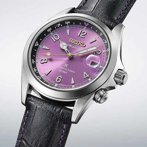
On the Alpinist, purple is restrained by traditional numerals and a stitched leather strap; on the Speedtimer, it energizes the tachymeter and chronograph layout. The Astron turns the colour into a gradient sky, using fine horizontal lines for depth. The Presage Cocktail Time approaches it through texture and translucent-looking reflections inspired by the Edo Murasaki cocktail. On the Seiko 5 Sports, purple and gold add polish to a familiar sports-watch shape. The Rotocall makes the boldest choice: purple is not simply a dial finish, but the rotating control interface itself, framed by an all-black case.
That distinction is the collection’s strongest design idea. Rather than repeating one anniversary dial six times, Seiko adapts the same palette to heritage, motorsport, high technology, mixology, accessible mechanical design and digital nostalgia. The result is a study in brand consistency without visual sameness—an unusually persuasive way to celebrate a Tokyo-born watchmaker.
Source & attribution
Related perspectives
Seiko’s purple Alpinist celebrates 145 years of adventure ↗