
Design · 2026-10-13
Beyond the colour: how great watch dials are actually made
An in-depth design essay on enamel, guilloché, meteorite, natural stone, stamped texture and photochromic surfaces—and why the process matters as much as the colour.
Save this watch to revisit later.
Share this article
By Chronolume digest · Original English summary · Based on ChronoLume original design essay; primary dial-making sources from anOrdain, Grand Seiko, Seiko, YEMA, Zenith, Rado and Farer
What to know
Most watch buyers notice the case first, but collectors often fall for the dial. It occupies only a few square centimetres, yet it carries typography, reflections, texture and a surprising amount of cultural memory. A green dial can look flat and inexpensive or deep and almost architectural depending on how its surface has been made. This is why two watches with apparently similar colours can feel completely different in person. The design is not merely printed on a substrate; it is the result of decisions about material, light, depth and the marks left by tools.
The starting point is an important distinction between representation and substance. A pattern can be printed to resemble woven fabric, stamped into metal to reproduce a textile texture, engraved by a tool or formed by an ancient material that already contains its own structure. None of these methods automatically guarantees beauty. What matters is whether the surface helps the watch communicate its intended character. A glossy enamel field expresses depth differently from a rough metallic landscape. The dial becomes a kind of miniature architecture: each finish changes the way light enters, moves and leaves.
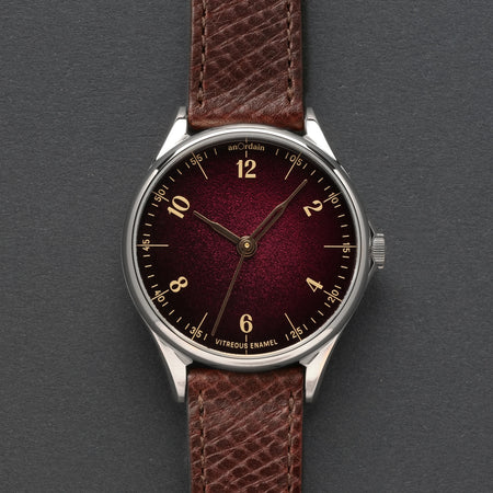
AnOrdain’s Model 1 Plum Fumé is a particularly beautiful demonstration of how a manufacturing problem can inspire an aesthetic breakthrough. The Glasgow workshop has described how experimental enamel on silver warped in the heat of a kiln. When the enamel was ground back, the resulting variation in thickness created a gradient: lighter toward the raised centre, darker near the edges. Rather than dismiss the accident, the team spent considerable time developing a silver dial blank with the right three-dimensional profile. A defect became a repeatable design language.
The Plum Fumé's rich garnet centre darkens toward a deep wine-red perimeter. Those tones are not merely printed as a fade. Layers of vitreous enamel are fired over a shaped silver blank, then worked until the gradient and lustre emerge. It is a demanding process because the dial must remain precise enough to fit the movement despite repeated exposure to heat. The hands, individually polished and heat-tempered to a warm metallic colour, show the same sensitivity to material. Here luxury is not primarily a precious-metal case; it is an accumulation of patient, hard-to-see decisions.
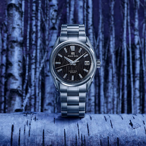
Grand Seiko approaches the dial as landscape. The Evolution 9 SLGH029 interprets white birch trees near the Studio Shizukuishi as a dynamic black pattern. The maker uses its developed surface texture to suggest vertical trunks emerging from darkness, and a highly legible set of hands and markers sits above this miniature terrain. Under direct light, the dial can reveal different ridges and shadows. Unlike a flat picture of a forest, the pattern changes as the watch moves. The connection to place is not incidental branding; it becomes the underlying geometry of the product.
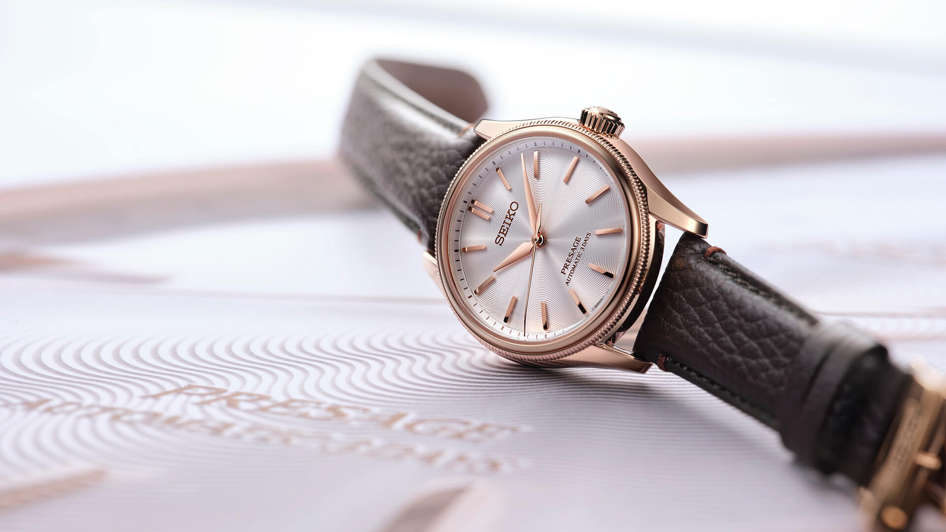
Seiko’s Presage Classic series offers a softer example with its Tomioka silk-inspired dials. The Japanese maker draws on a textile tradition to create finely patterned surfaces that recall the sheen and directionality of silk threads. The effect is very different from a literal photograph of fabric. It converts the qualities of a flexible material into a durable watch dial, using repetition and gentle changes in reflected light to suggest softness. It also demonstrates that a sense of craft can come from translating a material, not necessarily incorporating that material itself.
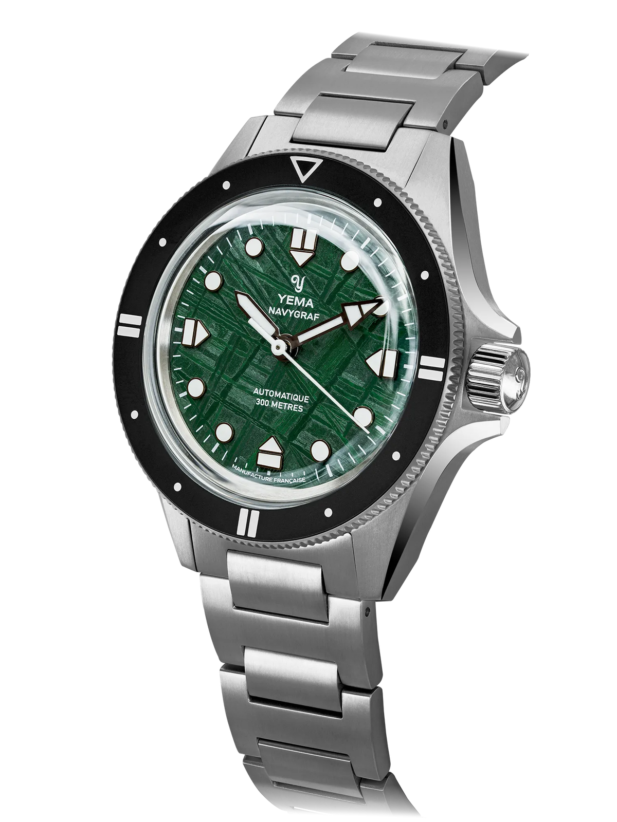
Some dial materials do not need a designer to invent a pattern. YEMA’s Navygraf Meteorite uses Muonionalusta meteorite, an iron-nickel material with a distinctive crystalline structure. The intersecting bands known as the Widmanstätten pattern formed through extremely slow cooling long before anyone conceived of a wristwatch. Cutting and treating the material makes those structures visible. The result is inherently variable: two pieces cut from the same meteorite are related, but not identical. The watchmaker's task becomes one of framing nature's own geometry without overwhelming it.
That autonomy brings both artistic value and practical responsibility. Natural stone and meteorite need careful selection, machining and protection. They do not behave like ordinary brass dial blanks; their variations can complicate consistency and make it harder to deliver precisely uniform appearances. For collectors, that difference may be the appeal. In a world of reproducible luxury, a dial whose exact pattern cannot be repeated offers a different kind of ownership. Yet natural scarcity should not become an excuse for poor legibility or decorative excess.
Zenith’s DEFY Extreme Lapis Lazuli II uses natural material as a point of contrast rather than an all-over field. Lapis lazuli counters, with their deep blue colour and possible golden pyrite flecks, sit among dark forged-carbon and titanium architecture. The chronograph's technical geometry makes the stone feel unusually vivid. It is a compelling collision of visual languages: mineral irregularity against a machine built to measure time in hundredths of a second. The layout avoids turning the stone into a passive background; the material remains a participant in the composition.

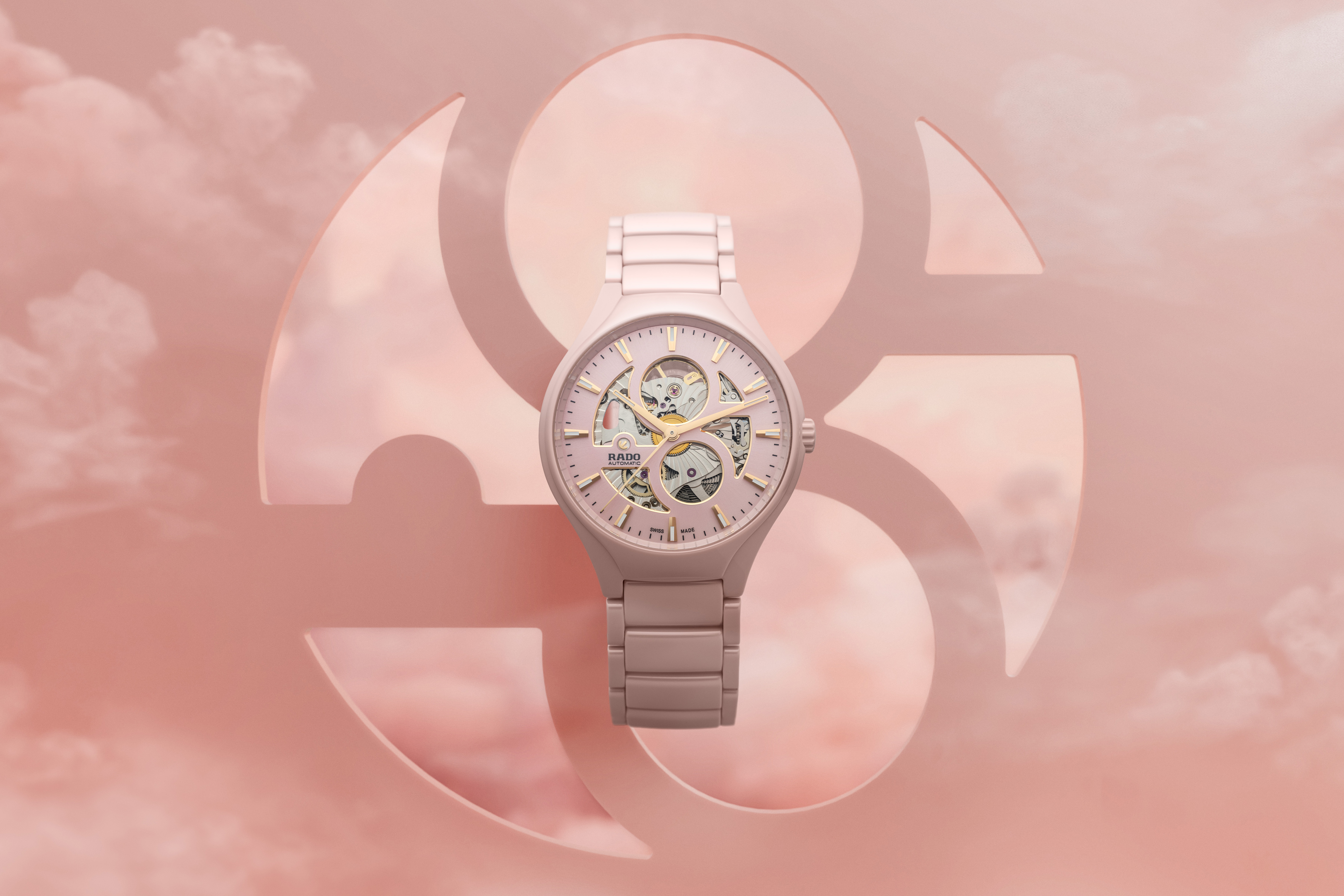
Texture can also be made to interact with its environment. On Rado’s True Round Open Heart Limited Edition, a photochromic dial moves from pale rose toward magenta when exposed to ultraviolet light. This is an entirely different strategy from enamelling or engraving. The visual state of the dial changes in response to the outside world, while the mechanical watch continues to run beneath it. A single product can present different personalities indoors and outside. The artistic idea is temporal, but not because the watch measures minutes or seconds.
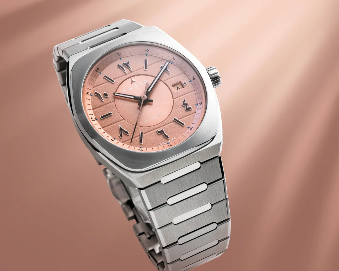
A dial's apparent simplicity can conceal a sophisticated stack of components. Farer’s Cuprum Eastern Arabic Limited Edition places brown Lumicast numerals over a salmon-toned textured surface. The applied characters have physical presence, not just contrasting colour, and they alter the perception of depth across the dial. The carefully chosen type forms matter as much as the materials: a numeral that is beautiful on a screen may become clumsy once turned into a raised object at this scale. Good watch typography is always an exercise in manufacturing constraints.
That brings us to a central design tension: decoration versus information. Highly textured dials create beauty by scattering and catching light, but watches must still tell time. Markers need sufficient contrast, hands must remain distinguishable, and the minute track cannot disappear into ornament. Grand Seiko often creates clear separation between the surface below and the polished indications above. Other brands use luminous material, dark framing or deliberately simplified markers. The best outcomes let the wearer first read the time and then discover additional visual detail.
Photography complicates the conversation. A dial shot straight on in diffuse studio lighting may look surprisingly flat. A dramatic macro image can exaggerate every grain, facet and reflection. Images are essential for discovering watches online, but they are translations of three-dimensional surfaces into two dimensions. Different light sources, white balance, viewing angle and even a browser screen can change how colour and material are perceived. When assessing a dial, look for more than a hero shot: angled views, moving light and images on the wrist tell a fuller story.
There is also a danger in treating craft as a ranking system. Hand-fired enamel is not automatically better design than a carefully stamped metal dial; natural meteorite does not inherently make a timepiece more thoughtful than a lacquered one. Those methods ask different questions and incur different compromises in cost, repeatability, fragility and freedom of form. Strong design emerges when the technique supports an idea. AnOrdain uses enamel to make colour feel deep, Grand Seiko translates landscape into a tactile pattern, and Rado uses light-sensitive chemistry to add a kind of play.
The next time a watch catches your eye, look past its stated colour. Ask how the surface was created, what happens when the wrist turns, and whether the material changes the experience of reading time. Consider whether its decorative story is specific enough to justify the method used. A dial is never simply the place where the hands happen to be. At its best, it is where craft, industrial design and the passage of time become visible in miniature.
Source & attribution
Related perspectives
October 2026: Our Complete Selection of Watches Under €1,000 ↗
Beautifully bizarre: the automatic watches that refuse to look normal ↗
The Rolex design language: why evolution beats reinvention ↗