Design · 2026-11-07
Beyond the circle: why the shape of a watch changes everything
From Piaget's architectural Andy Warhol case to the Tissot Heritage 1973 and DWISS S1, why watch design starts with the silhouette.
Chronolume · Source-based analysis · Research checked 2026-11-07
Save this watch to revisit later.
Compare existing Chronolume catalogue photographs and model descriptions; original interpretive essay.
The analysis
A wristwatch is almost always imagined as a circle. The logic is persuasive: hands rotate around an axis, gears turn, and a round case accommodates a circular movement. Yet some of the most memorable watches begin when a designer questions this apparently inevitable shape.
The cushion case occupies the intriguing territory between circle and square. Its rounded corners soften a broad, architectural silhouette. Depending on its proportions, the same basic outline can suggest a seventies instrument, an Art Deco object or a contemporary sculpture. Shape is not a neutral container: it establishes expectations before we read the dial.
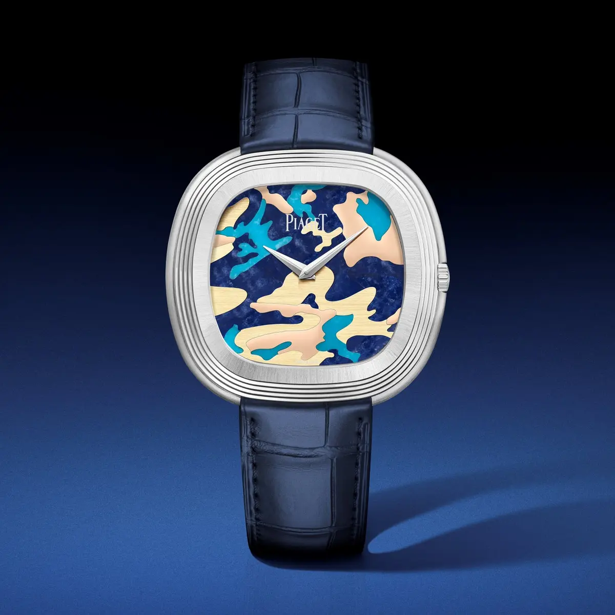
Consider the Piaget Andy Warhol Camouflage. The stepped, rounded-square case frames a visually complex stone-marquetry dial. A conventional round case would change the entire composition. The exterior is not decoration added at the end; it gives the watch its identity from the first glance.
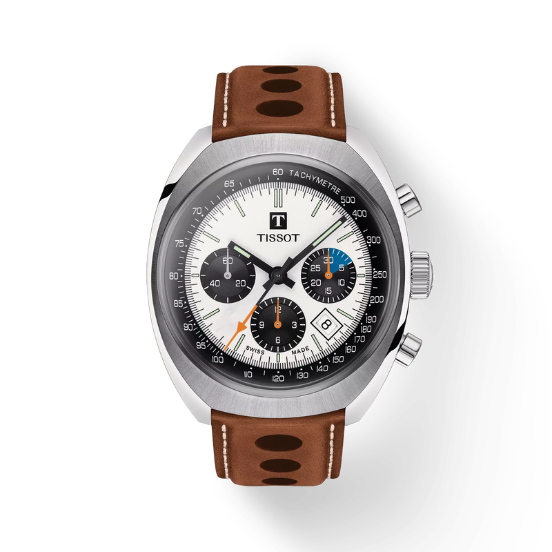
The Tissot Heritage 1973 takes a different route. Its broad cushion profile, chronograph registers and racing-inflected details evoke an age when a mechanical wristwatch was also an instrument associated with the track. It shares a family resemblance with the Piaget in outline, but its cultural language is functional and nostalgic rather than artistic.
The distinction reveals the importance of proportion. A millimetre of width, the slope of a lug or the relationship between bezel and dial can alter a watch's personality. Case design is a form of visual communication, not simply protection for the movement.
Independent maker DWISS pushes that idea into time display itself. The S1 Black uses a wandering-hours system inside a sculptural case. Its layout asks the wearer to learn a different way of looking, and its exterior prepares us for that encounter. The boundary between industrial design and interface design begins to disappear.
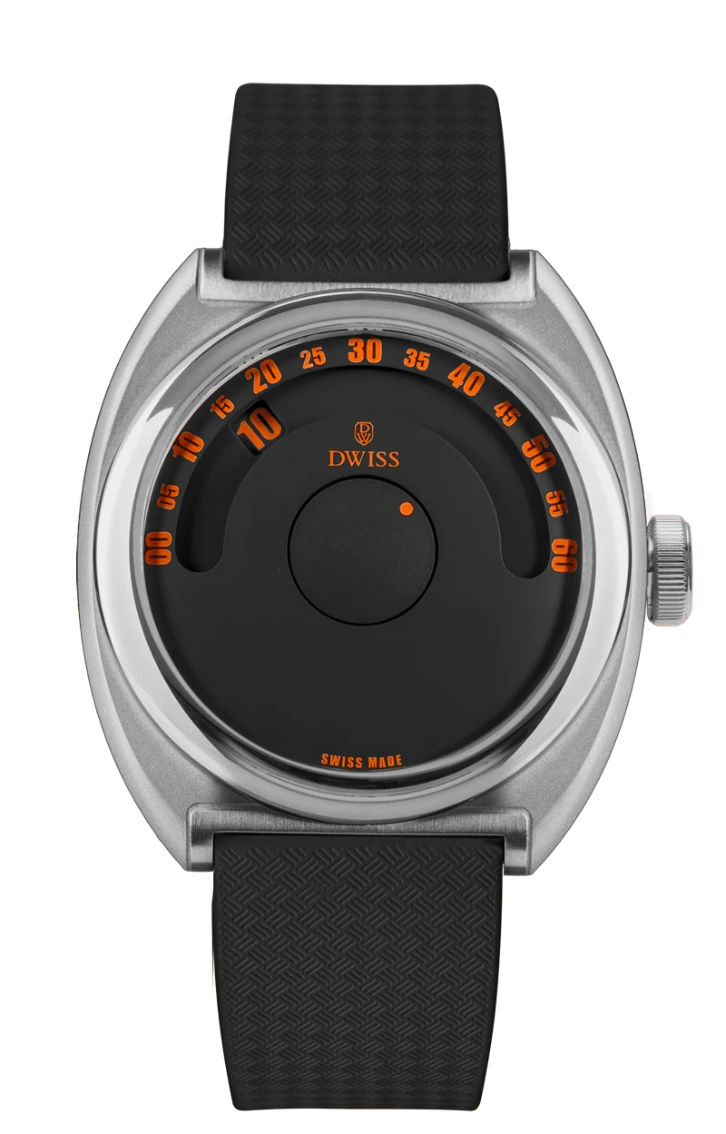
Try a simple test: remove the logo, the numerals and the colour from a watch. Reduce it to a black silhouette. Can you still recognise it? Strong product identities often survive that reduction because their distinctive qualities live in the shape, rather than in branding alone.
Round watches will remain practical, familiar and versatile. But the forms we remember are frequently the ones that take a risk with geometry. A wristwatch does not have to be circular to make time feel complete.
Share this article
Sources & research
Research checked 2026-11-07. Specifications are manufacturer figures; interpretation and calculations are identified in the text.
- https://chronolume.page/article/piaget-andy-warhol-camouflage-g0a51242-2026
- https://chronolume.page/article/tissot-t1244271603101-profile
- https://chronolume.page/article/dwiss-s1-black-wandering-hours-2026