
Design · 2026-10-21
Instruments with charisma: understanding Breitling’s design philosophy
From slide rules and rider tabs to racing colours and sculptural dress watches, Breitling designs by turning functional instruments into assertive objects.
By Chronolume digest · Original English summary · Based on Chronolume original analysis based on Breitling’s official product, heritage and launch materials
Save this watch to revisit later.
What to know
Breitling’s design language begins with a productive contradiction. Its watches are built around instruments—chronographs, rotating bezels, flight calculations, diving scales and high-accuracy quartz—but they rarely look anonymous or purely utilitarian. The company’s best work treats function as theatre. Pushers are deliberately visible, bezels invite touch, dial scales become graphic texture and colour is used to clarify information as much as to create personality.

That approach grew from a long engagement with the chronograph. Breitling’s separate two-o’clock start/stop pusher in 1915 and later two-pusher layout helped establish how modern wrist chronographs are operated. The important design lesson was not merely mechanical: different actions deserved different physical controls. Mushroom pushers on the contemporary Top Time still make that relationship legible. The wearer sees—and feels—what the watch is built to do.
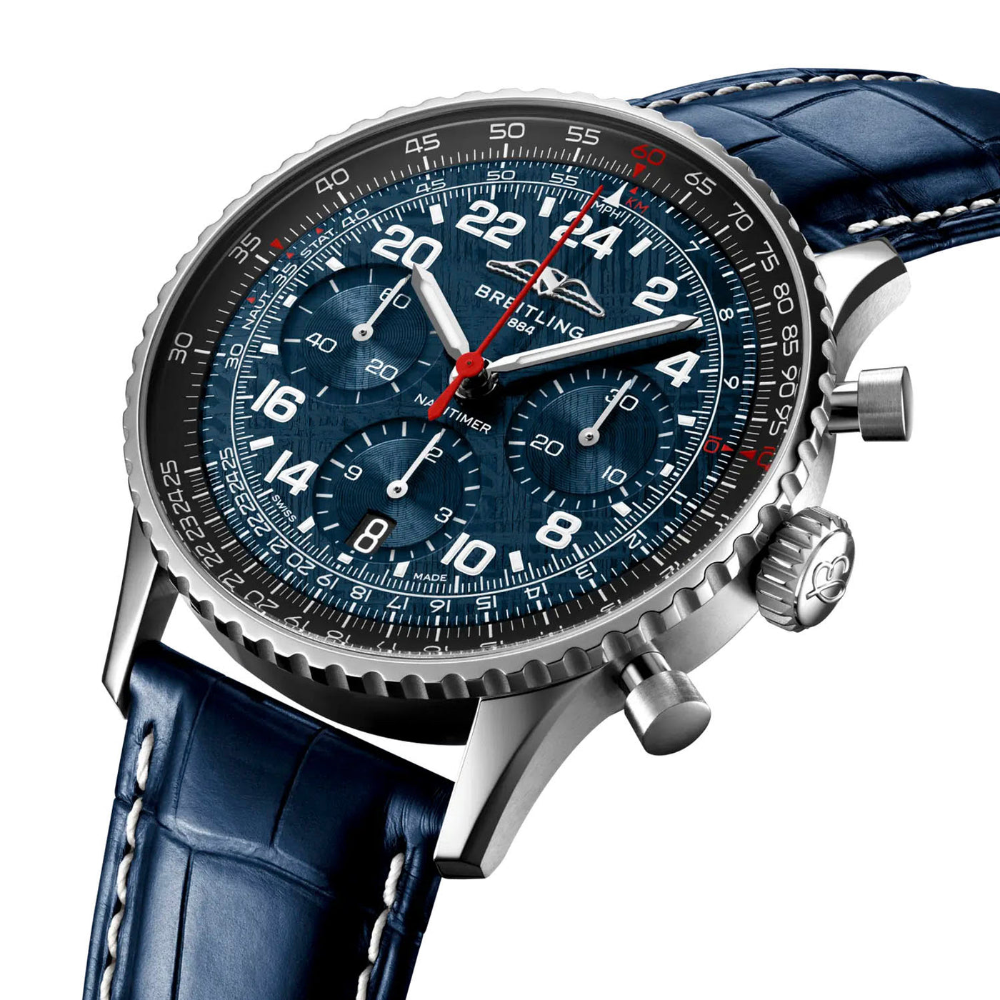
The Navitimer Cosmonaute Artemis II shows Breitling’s willingness to preserve visual complexity when the complexity has meaning. Its circular slide rule is dense because it is a calculating instrument; its 24-hour dial exists because sunrise and sunset lose their ordinary rhythm in orbit. The meteorite dial adds narrative material, but the watch remains recognisable through information architecture rather than decorative styling alone.
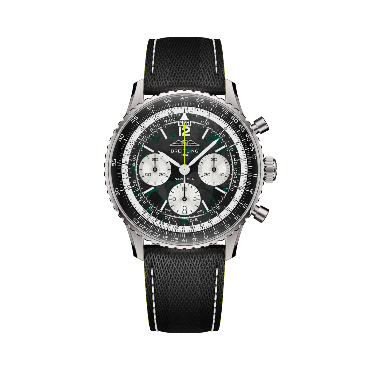
That same architecture can travel into a different world. The Aston Martin Aramco Navitimer replaces steel with titanium and introduces carbon fibre and racing green. It does not erase the slide rule or chronograph hierarchy. Breitling’s collaboration strategy works best when a partner changes material, colour or cultural context while the underlying product remains unmistakably Breitling.
The Chronomat expresses the philosophy through hardware. Four raised rider tabs divide the bezel into quarters and protect its surface; the Rouleaux bracelet turns a sequence of rounded cylinders into a flexible visual signature. In the 2026 Chronomat B01 42, the redesign improves bracelet integration and reduces thickness without deleting those recognisable elements. This is evolutionary industrial design: remove friction, preserve identity.
Breitling’s sea watches demonstrate a more restrained side. The Superocean Heritage B31 40 avoids the aggressive geometry typical of many divers. Its broad arrow hour hand, spear minute hand, thin ceramic bezel and mesh-like strap reference the 1957 originals. Two hundred metres of water resistance and a modern movement sit inside a silhouette that can move from water to dinner without pretending to be military equipment.
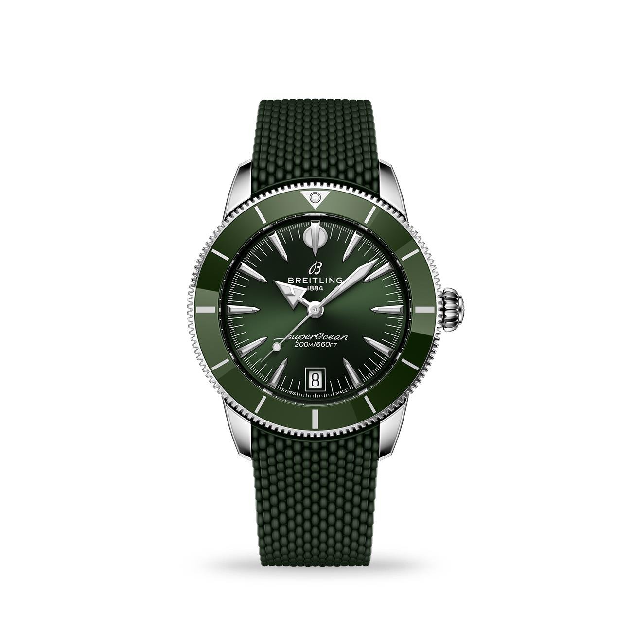
The Superocean Heritage B01 Chronograph 42 also reveals a recurring Breitling principle: a complication should be integrated into the visual balance rather than stacked on top of it. Tone-on-tone counters reduce clutter, the date remains at six and the ceramic bezel creates a strong outer boundary. It is a chronograph and a dive watch, yet neither function visually overwhelms the other.
Top Time represents the brand at its most playful. The Eddy Merckx edition uses yellow, blue and squircle counters to turn a sporting biography into dial graphics. The Aston Martin DB5 tribute uses wood, silver and brown leather to suggest a grand tourer’s interior. These watches do not hide their references, but the storytelling is built from watchmaking components rather than printed logos alone.
The smaller Top Time B31 is equally important. At 38mm and without a chronograph, it challenges the assumption that Breitling must be large and mechanically crowded. The pale-blue minute track, magnified date and perforated strap carry enough character to sustain a simpler watch. Its B31 movement also demonstrates a strategic shift: the manufacture identity is no longer tied exclusively to complicated chronographs.
Lady Premier pushes farther from the tool-watch stereotype. The purple automatic 36 uses a smooth case, lozenge hands, ombré leather and carefully controlled colour. It still retains chronometer certification and 100-metre water resistance. That combination matters. Breitling is not replacing engineering with jewellery; it is testing whether engineering can sit beneath a softer and more sculptural exterior.
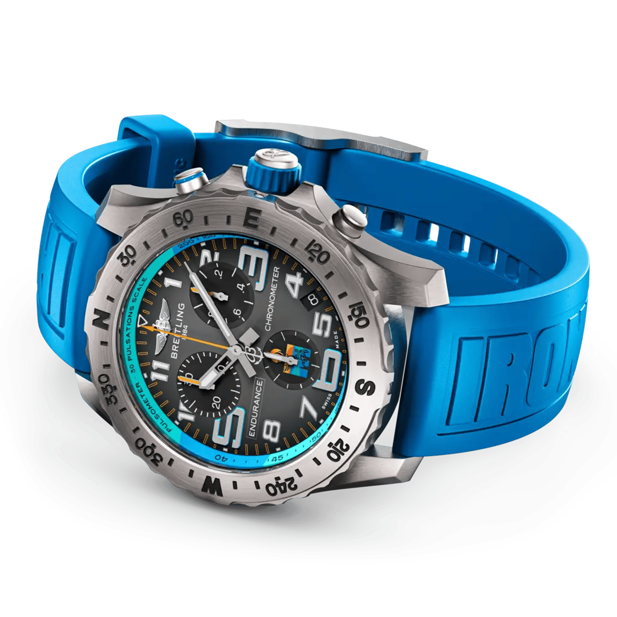
The Professional collection takes the opposite route. The Endurance Pro IRONMAN chooses thermocompensated quartz because accuracy, shock resistance and low maintenance suit endurance sport. Large numerals, a pulsometer scale and a compass bezel form a clear hierarchy around the wrist. Breitling’s use of quartz here is philosophically consistent: the movement is selected for the task rather than for mechanical prestige.
Across these collections, five principles repeat: make operation visible; allow technical scales to become graphic identity; preserve historic signatures while refining proportion; use colour as information and emotion; and match the movement to the purpose. The result is not minimalism in the Ramsian sense. Breitling is more exuberant than that. Its strongest watches are legible machines with charisma—objects that explain what they do, then make the explanation visually memorable.
At a glance
| Article type | Long-form design analysis |
|---|---|
| Brands and collections | Breitling; Navitimer, Chronomat, Superocean Heritage, Top Time, Professional, Lady Premier |
| Featured watches | 10 recent references |
| Themes | Instrument design, chronograph controls, visual hierarchy, materials, colour, ergonomics and movement choice |
| Periods covered | 1915 origins to 2026 releases |
Explore the watches
Breitling Navitimer B02 Cosmonaute Artemis II AB02307A1C1P1 · AB02307A1C1P1 ↗
Breitling Chronomat B01 42 AB0158101L1A1 · AB0158101L1A1 ↗
Breitling Navitimer B01 Aston Martin Aramco F1 EB01381A1B1X1 · EB01381A1B1X1 ↗
Breitling Superocean Heritage B31 Automatic 40 AB3110361L1S1 · AB3110361L1S1 ↗
Breitling Endurance Pro IRONMAN E823105A1M1S1 · E823105A1M1S1 ↗
Share this article


