Design · 2026-10-21
Stop, start, reset: how exceptional chronographs turn elapsed time into design
A chronograph is more than a watch with extra subdials. Ten remarkable examples show how pushers, scales, split seconds, flyback control and unconventional displays make elapsed time tangible.
By Chronolume digest · Original English summary · Based on Chronolume original analysis based on linked watch articles and their cited sources

Save this watch to revisit later.
What to know
A chronograph is one of the few watch complications that asks to be touched. A moon phase can be admired and a perpetual calendar consulted, but a chronograph begins with an action: press, watch a hand break away from ordinary time, press again, then return everything to zero. That small sequence turns the wristwatch from a passive display into an instrument. It also creates a demanding design problem. A chronograph must show civil time and a second, temporary layer of time without allowing either to become unreadable.
The familiar solution—two pushers, two or three subdials and a scale around the edge—is so established that it can look inevitable. It is not. Every element represents a decision about hierarchy. Should elapsed seconds occupy the central hand or a subdial? Is a thirty-minute counter enough? Should the tachymeter dominate the perimeter? Can start, stop and reset share one control? The most interesting chronographs expose those decisions. They make mechanics legible through shape, spacing, colour and resistance under the fingertip.
The Angelus Chronographe Tachymètre condenses the ritual into a single pusher hidden inside the crown. Start, stop and reset happen sequentially through one control, leaving the 37mm case almost as calm as a conventional dress watch. Its petrol-blue registers and matching tachymeter bring back the visual energy of a sporting chronograph, but the case profile stays disciplined. The design lesson is economy: complexity does not have to announce itself through more hardware.

A split-seconds chronograph does the opposite. The F.P. Journe Chronographe Rattrapante lets two central seconds hands begin together, then separates one so that an intermediate result can be read while the other continues. Press again and the split hand catches up. Journe combines that mechanical drama with a monopusher calibre and a large date. In titanium, the watch looks sporty, but its real character is kinetic: the dial stages two times that agree, disagree and reunite.

Parmigiani Fleurier questions whether a chronograph needs permanent subdials at all. The Tonda PF Chronographe Mystérieux stacks five coaxial hands at the centre. When the chronograph is idle, its elapsed-time hands align with the ordinary display and largely disappear. Activate it and the concealed information comes alive. The idea is technically elaborate—the watch uses a triple-clutch arrangement—but visually quiet. Instead of decorating the dial with complication, Parmigiani makes the complication an event.

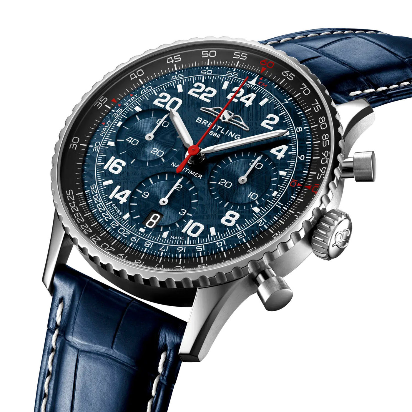
The Breitling Navitimer Cosmonaute Artemis II proves that density can also be purposeful. Its dial covers a full 24 hours, while the slide-rule bezel surrounds the chronograph with a calculating instrument. A meteorite surface adds texture, yet the watch’s identity comes from information architecture. Hours, elapsed time and calculation coexist because each occupies a distinct zone. It is not minimalist, but it is organised—an important difference.
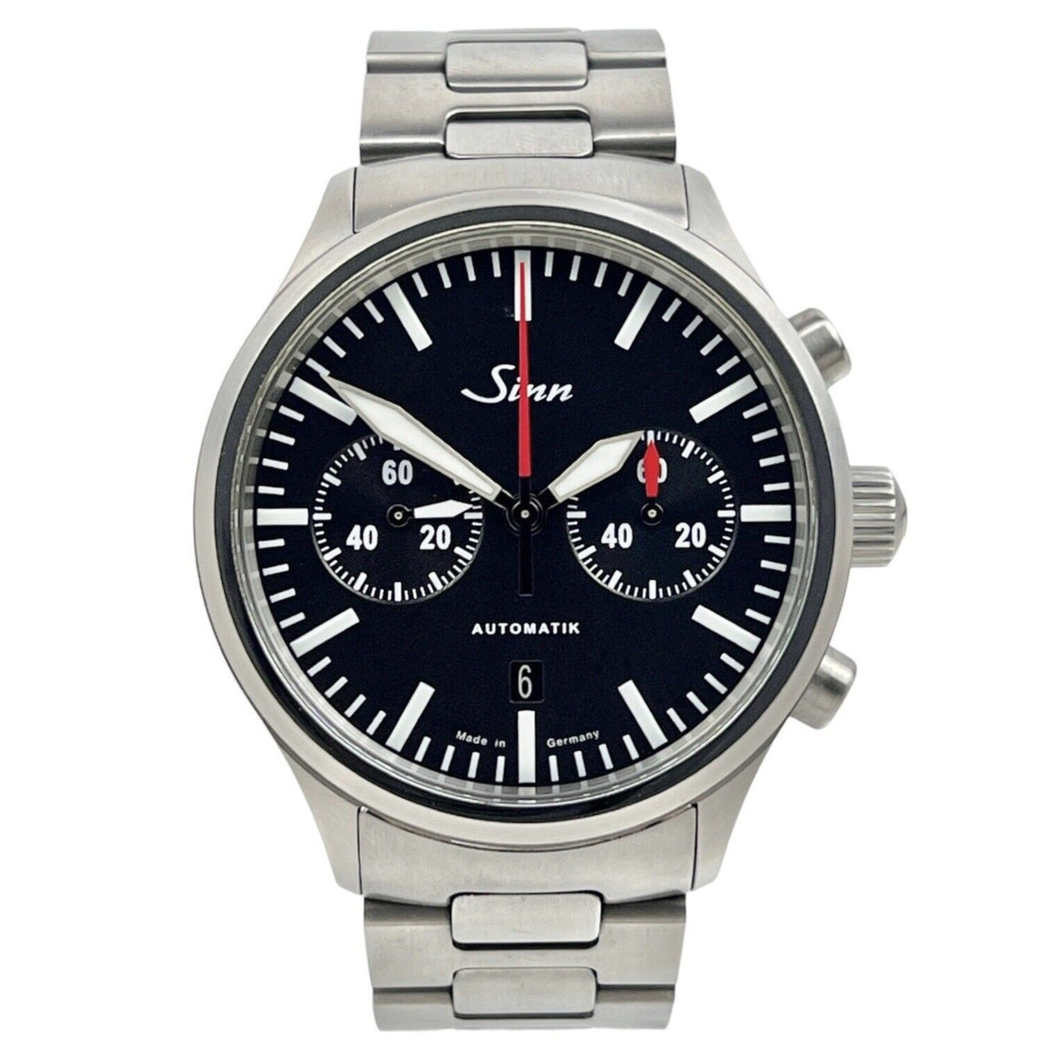
Most chronographs devote the central hand to elapsed seconds and force minutes into a small register. The Sinn 936 makes the longer interval easier to read through its SZ05 movement and prominent 60-minute counter. Its bicompax symmetry, restrained colour and hardened case strip the genre back to a working instrument. The result shows that practical innovation is sometimes less about adding a function than enlarging the one people actually need to see.
Quartz changes the design equation again. The Bulova Lunar Pilot ‘Black Hole’ uses a 262kHz high-precision quartz chronograph movement, selected for accuracy rather than mechanical spectacle. Its black-PVD case, bracelet and dial compress the lunar-tool aesthetic into a nearly monochrome object, while contrasting markings preserve the timing hierarchy. At 41mm, this edition also demonstrates how proportion can modernise a historically large case without erasing its identity.
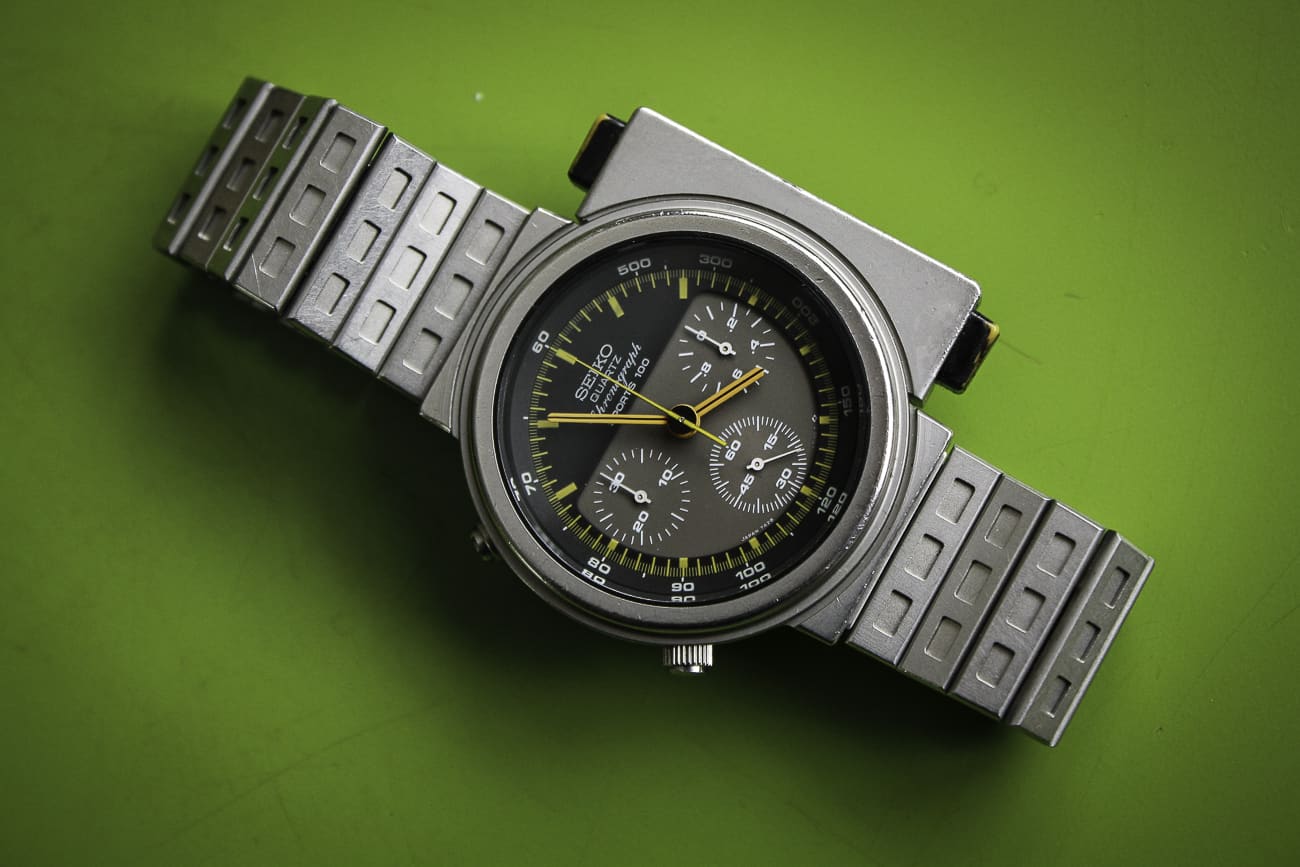
The Seiko Giugiaro 7A28-7000 ‘Ripley’ treats ergonomics as sculpture. Giorgetto Giugiaro shifted the chronograph controls into an asymmetric extension, making the watch look like a handheld device strapped to the wrist. The shape is startling, but not arbitrary: the controls become a distinct operational zone. Its analogue quartz calibre reinforces that 1980s industrial character. Few chronographs make the act of pressing a button so visible before the button has even been touched.
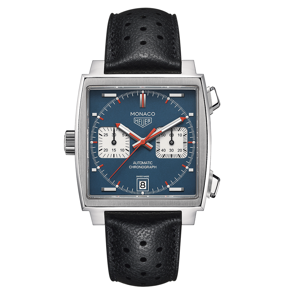
The TAG Heuer Monaco Calibre 11 achieves a different kind of separation. A square 39mm case, left-side crown, right-side pushers and white counters on blue give the watch a layout that can be recognised from across a room. The geometry turns the chronograph into architecture: square case, circular registers, horizontal control line. Its association with Steve McQueen and *Le Mans* amplified the icon, but the design survived because the silhouette was already strong enough to carry the story.
Materials can alter the same grammar. The Tudor Black Bay Chrono ‘Carbon 26’ translates a familiar two-register layout into a 42mm carbon case with sharp white and yellow accents. Carbon links the object to contemporary Formula 1, yet the watch remains readable because the contrasting counters and timing hand behave like visual signs. The limited edition is expressive, but its exuberance sits on top of a disciplined chronograph hierarchy.
The Hanhart 417 TI Desert Pilot focuses attention on the flyback. One press resets and immediately restarts the chronograph, eliminating the stop-reset-start sequence. That shortcut began as a practical aviation tool, and Hanhart reinforces it with a fluted rotating bezel, a red marker and strong Arabic numerals. The sand-coloured dial and Grade 5 titanium case soften the military association without disguising the operational logic beneath it.

These watches also reveal why movement architecture matters to design even when it remains invisible. A column wheel can give pusher operation a crisp, coordinated feel; a vertical clutch can reduce the initial jump of the seconds hand; a lateral clutch allows the engagement to be admired through a display back; quartz can prioritise precision, shock resistance and compact control. The wearer may never see every component, but the movement determines how firmly a button presses, how cleanly a hand starts and how thick the case must become.
Scales are the chronograph’s typography. A tachymeter converts time over a known distance into speed. A pulsometer turns a counted number of heartbeats into a rate. A telemeter estimates distance from an event seen before it is heard. Each asks the wearer to follow a specific reading sequence, so placement is never merely decorative. The best scales sit at the edge of attention until needed; the worst become costume, implying an instrument without supporting its use.
Subdial arrangement is equally expressive. Bicompax designs often feel calm because two registers balance each other across the horizontal axis. Tricompax layouts can offer more information, but require stronger differences in hand length, tone or scale. Tone-on-tone counters make a chronograph more discreet; contrasting ‘panda’ registers make it faster to parse. There is no universally correct arrangement. The goal is to make elapsed time feel like a coherent second system rather than visual debris scattered across a time-only watch.
That is why exceptional chronographs remain compelling even when a phone can time an interval more accurately. They transform duration into an encounter between finger, mechanism and graphic design. Angelus reduces the controls, Journe splits the seconds, Parmigiani hides the display, Breitling organises density, Sinn enlarges usefulness, Bulova and Seiko exploit quartz, TAG Heuer turns geometry into identity, Tudor uses advanced material and Hanhart shortens the operating sequence. The chronograph endures because it does not merely tell time. It lets us intervene in it.
At a glance
| Article type | Long-form design analysis |
|---|---|
| Subject | Chronograph watch design and interaction |
| Featured watches | 10 Chronolume-profiled chronographs |
| Themes | Pushers, subdial hierarchy, scales, monopusher, rattrapante, flyback, quartz, case geometry and movement architecture |
| Linked Chronolume articles | 10 |
| Image policy | Exact-model photography inherited from existing published Chronolume articles with original credits and source URLs preserved |
Explore the watches
Tudor Black Bay Chrono Carbon 26 M79377KN-0003 · Black Bay Chrono Carbon 26 M79377KN-0003 ↗
Angelus Chronographe Tachymètre Steel Grey · Chronographe Tachymètre Steel Grey ↗
F.P. Journe Chronographe Rattrapante titanium · Chronographe Rattrapante titanium ↗
Bulova Lunar Pilot Black Hole 98A335 · 98A335 ↗
TAG Heuer Monaco CAW211P.FC6356 · CAW211P.FC6356 ↗
Hanhart 417 TI Desert Pilot 42mm · H721L.250 ↗
Breitling Navitimer B02 Cosmonaute Artemis II AB02307A1C1P1 · AB02307A1C1P1 ↗
Share this article