Design · 2026-11-03
F.P. Journe and the art of mechanical composition
Why the most distinctive language in independent watchmaking is built from asymmetry, typography and the decision to let mechanical ideas determine the dial.
Chronolume · Source-based analysis · Research checked 2026-11-03
Save this watch to revisit later.
Desk-based comparative visual analysis of official exact-model galleries, brand technical material and independent historical reporting. No hands-on access, no interviews, no original timing tests; interpretation identified as editorial critique.
The analysis
F.P. Journe makes watches that are often identified from across a room without relying on a conspicuous bezel, an integrated bracelet or an oversized emblem. The clue is usually the dial: a circle placed unexpectedly inside another circle; a power-reserve scale sitting where another brand might put a logo; a narrow serif numeral wrapped around a small island of guilloché. The result is a recognizable visual language that survives wildly different mechanisms. That is a more interesting achievement than mere consistency. It suggests an approach to design in which the position of each indication can explain the idea of the watch.
François-Paul Journe's motto, Invenit et Fecit — invented and made — appears on the dial as both a maker's declaration and an unusually compact design brief. It argues that authorship begins with the mechanism rather than with surface decoration. But a watch is never purely mechanical or purely graphic: the hand, dial, movement and case must negotiate with one another. Journe's distinctive contribution is to make those negotiations visible, though not always effortless for the wearer.
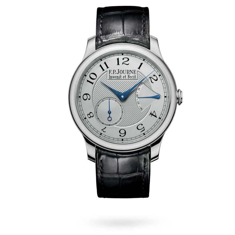
1. ASYMMETRY AS AN ORGANISING SYSTEM. Consider the Chronomètre Souverain. The centre hands and peripheral numerals give it the apparent formality of a classical dress watch, while a seconds register sits below and left of centre, around 7:30. A power-reserve display answers it near the upper-right quadrant. They are not aligned like architectural columns; they are balanced like masses in a poster. The empty dial surface between them is active, allowing the indications to remain distinct. This is designed imbalance: a composition that feels settled without being symmetrical.
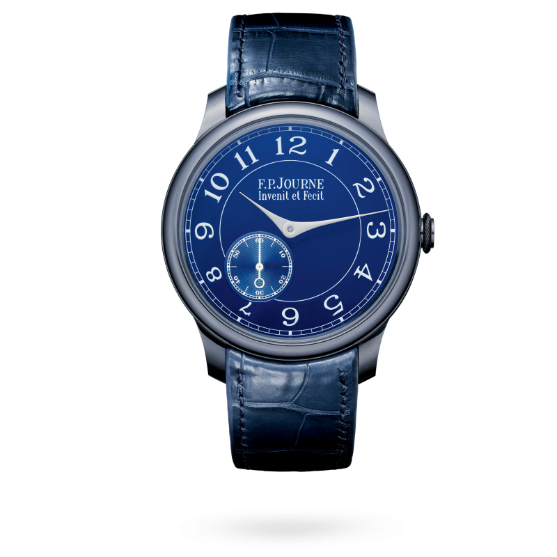
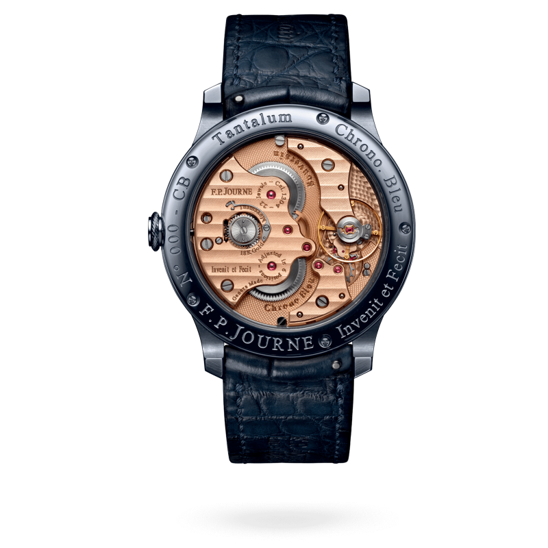
The Chronomètre Bleu makes the same point more economically. Its largely uninterrupted blue dial, silver-coloured hands and small seconds at about 7:30 reveal how much personality can be created with almost no furniture. The blue is not simply a trendy colourway. It works with the darker grey of the tantalum case to replace the familiar warm-gold-and-white vocabulary of traditional dress watches with something nocturnal. What looks simple in a frontal photograph becomes surprisingly variable under oblique light. Here restraint is not an absence of design; it is a decision to let material, type and a single displaced register do the work.
2. TYPOGRAPHY IS A MECHANICAL INTERFACE. Journe's hour numerals are recognisably drawn rather than treated as generic furniture. The varying strokes, generous curves and carefully distributed spacing make the outer track feel more like a historical scientific instrument than a jewellery advertisement. On many models, slender blued hands cut through this lettering without obscuring its character. The result is not universally legible at a glance: multiple scales, odd subdial placements and tiny labels can demand a second look. Yet the complication is also an invitation to read the watch rather than merely glance at it. The typography makes that act of reading feel intentional.
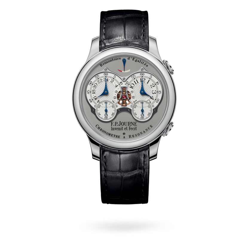
3. THE DIAL CAN REVEAL THE IDEA. On the Chronomètre à Résonance, two time indications share the dial because the mechanism uses two regulating systems. The visual pairing is unusually literal: the watch describes its own experiment with synchronization. The two displays do not merely create a fashionable dual-time silhouette; they turn the technical hypothesis into a visible relationship. The dial is a diagram first and an ornament second. This distinction matters. A designer copying the twin-dial arrangement would reproduce a look, but not the reason that look exists.
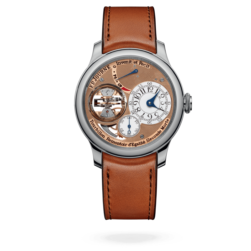
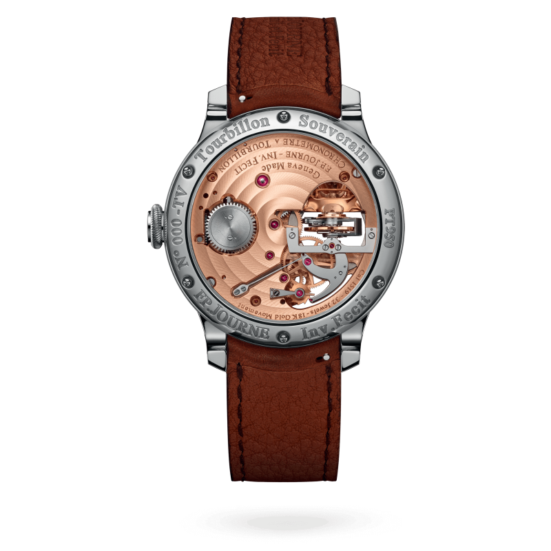
The Tourbillon Souverain takes this idea to another extreme. In its vertical-tourbillon form, the time is pushed to the right and the rotating cage occupies a mirrored recess at the left. The visible tourbillon becomes a spatial event, almost a tiny architectural installation, while the guilloché rose-gold movement bridges form the dial itself. Unlike the quieter Souverain, this is theatrical: the mechanism is deliberately illuminated and framed. The composition still follows the same logic, however. The dramatic object claims one territory; the information that must be read claims another.
4. MATERIALS ARE PART OF THE GRAMMAR. Journe's move to 18-carat rose-gold movement plates and bridges in the 2000s gave the back of many watches a recognisable warmth. Gold is not just a price signal here. It becomes a recurring hue linking the visible mechanics to the dial and hands. The cases, meanwhile, often remain relatively quiet: precious metals, rounded profiles, fine lugs and a distinctive knurled crown. That restraint creates a frame rather than a rival focal point. The Chronomètre Bleu's tantalum is an instructive exception: its heavier, dark metallic appearance shifts the entire visual temperature.
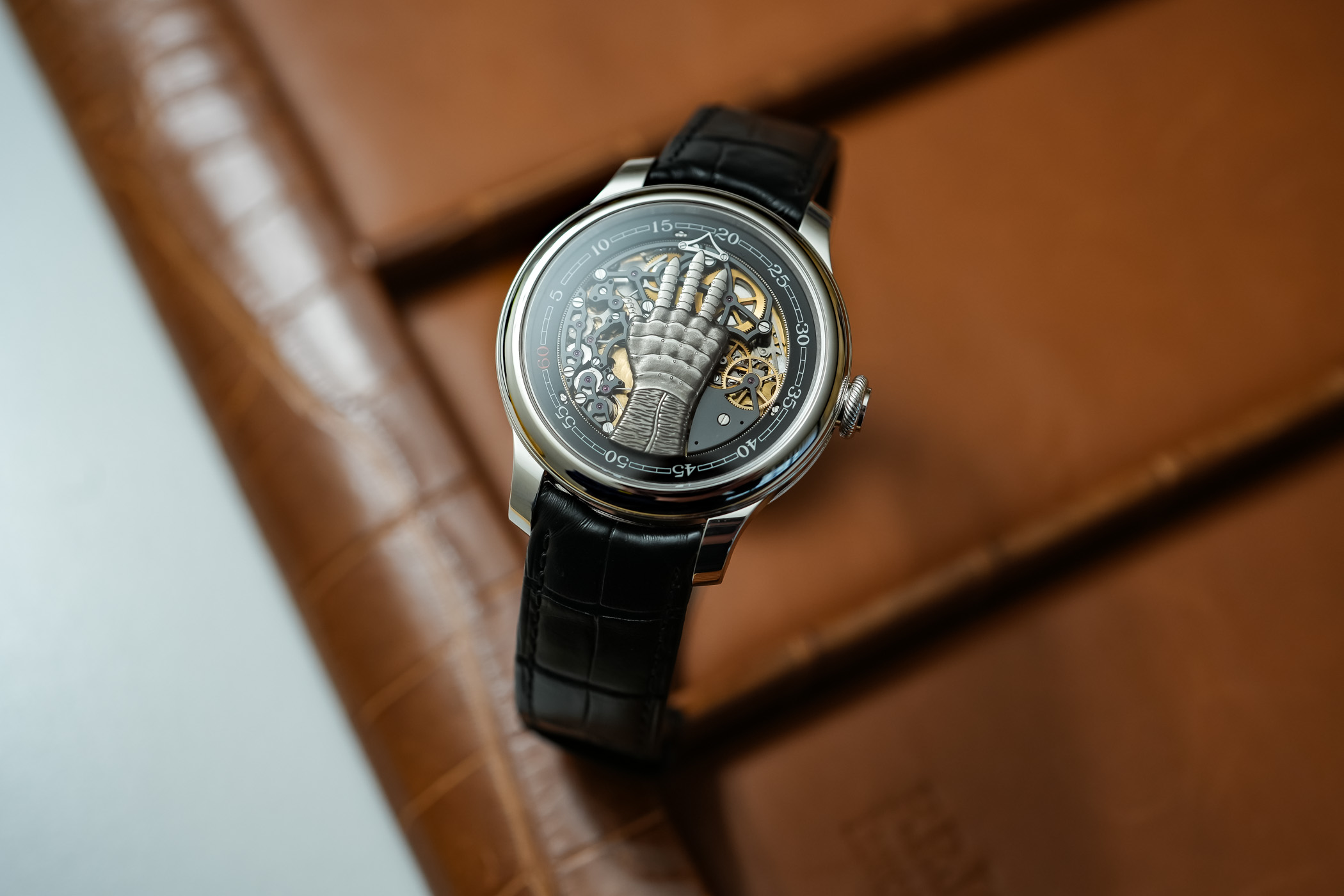
5. WHAT HAPPENS WHEN THE FORMULA BREAKS? The FFC, developed with an idea from filmmaker Francis Ford Coppola, replaces conventional hands with an articulated mechanical hand that indicates hours using fingers. On paper it sounds like an elaborate party trick. Visually, it asks a more serious question: when the method of displaying information changes completely, which parts of a watch still make it recognisable as its maker's? The rounded case, disciplined framing and attention to the mechanical theatre preserve a trace of Journe, but the face is no longer governed by the same graphic rules. It is a useful counterexample to the idea that brand design is only a set of fonts and colours.
An even more radical exception is the élégante. Its tonneau-shaped titanium case and luminous, almost contemporary instrument-like face are unlike the classic round chronometers. The electromechanical movement enters standby after a period without motion, then returns the hands to the correct time when activated again. It would be easy to dismiss this as an eccentric detour from traditional horology. Instead, the élégante shows that Journe's identity can also be located in an appetite for solving a problem differently. The watch speaks a different visual dialect because the brief itself has changed.

6. THE COST OF A STRONG SIGNATURE. Not every Journe dial is a triumph of instantaneous clarity. Complicated layouts can create crowded islands of information, and the recurring offset registers may at times feel like a mannerism rather than the only possible solution. There is also a risk that the aura of rarity turns every unusual decision into unquestioned genius. A sound design critique should resist that reflex. The better test is whether a display makes its complication understandable, whether the visual hierarchy survives in real use and whether each choice would still be convincing without the famous signature on the dial.

Viewed together, the Chronomètre Souverain, Bleu, Résonance, Tourbillon, FFC and élégante suggest a coherent answer to the question of why F.P. Journe matters to contemporary watch design. His most successful watches do not simply decorate timekeeping. They give precision, experimentation and even eccentricity a visible structure. Their beauty is often a by-product of allowing a mechanical idea to determine a composition. For designers beyond watchmaking, that may be the lasting lesson: a recognisable identity is strongest not when every product looks identical, but when every product seems to have been reasoned through by the same mind.
Share this article
Sources & research
Research checked 2026-11-03. Specifications are manufacturer figures; interpretation and calculations are identified in the text.
- https://www.fpjourne.com/en/invenit-et-fecit
- https://www.fpjourne.com/en/collection/boutique-collection/chronometre-souverain
- https://www.fpjourne.com/en/collection/classique-collection/tourbillon-souverain
- https://www.fpjourne.com/en/collection/elegante-collection/elegante-40-mm-titanium
- https://www.hodinkee.com/articles/a-look-back-at-20-years-of-the-fp-journe-chronometre-souverain