
Design · 2026-11-03
Patek Philippe: five ways to control attention
From the Calatrava’s textured border to the Cubitus’s assertive outline, five watches reveal how Patek Philippe balances ornament, information and empty space.
Chronolume · Source-based comparison · Research checked 2026-11-03
Save this watch to revisit later.
Compared official exact-reference photographs and manufacturer specifications; verified all seven distinct images by download and visual inspection. Source-based visual criticism, no wearing, measurements, interviews or claim of new release. Five references checked against full live published/draft article inventory and absent; standalone catalogue insertion not performed.
The analysis
Patek Philippe becomes more interesting when we stop asking whether a watch looks expensive and ask where it asks us to look. A hobnail bezel pulls the eye towards an edge. A dark oval dial makes its surrounding gold feel brighter. A broad square case turns a familiar arrangement of hands and markers into a more assertive object. These are decisions about visual attention, and they offer a more useful way into Patek’s design than treating every reference as an expression of the same timeless elegance.
Five watches make that argument particularly clearly: the Calatrava 6119R-001, Golden Ellipse 5738/1R-001, Travel Time 5224R-001, Annual Calendar Travel Time 5326G-001 and Cubitus 5821/1A-001. They are new subjects for Chronolume’s coverage, not five newly announced releases. Read together, they reveal a manufacturer working with several competing ideas of refinement: emptiness, ornament, information, informality and physical presence.
The Calatrava: put the activity at the edge
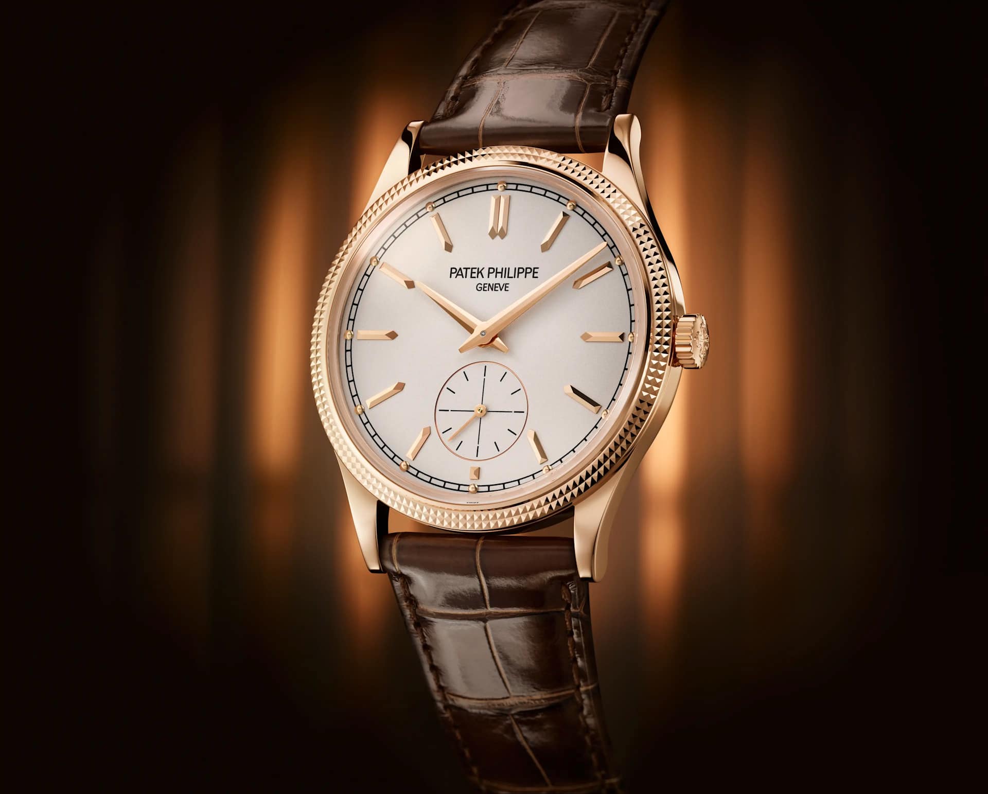
The 6119R begins with a deceptively busy border. Its Clous de Paris bezel breaks reflected light into small repeated units; inside that border, the silvery dial becomes relatively quiet. The faceted gold markers and dauphine hands belong to the same visual family, while the small-seconds circle gives the lower half of the dial a centre of gravity. This is restrained design achieved by distributing detail, rather than eliminating it.
That distinction matters. Imagine moving the hobnail pattern onto the dial and leaving the bezel smooth: the same amount of decoration would interrupt the hands’ territory. Here the border contains the ornament and the centre remains readable. Even the seconds display helps establish a hierarchy. It gives movement its own small stage instead of sending a long central hand repeatedly across the composition.
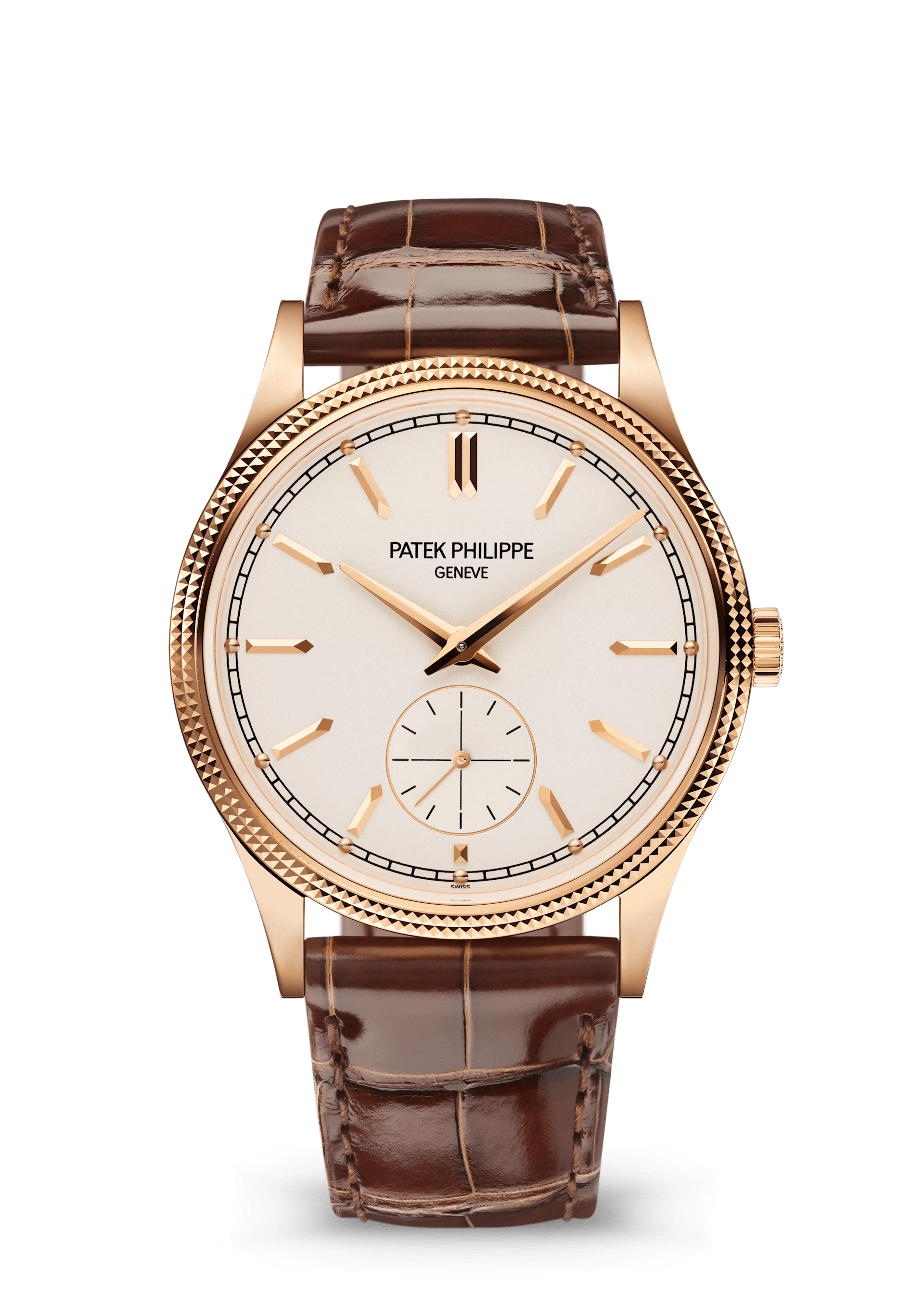
Patek lists a 39 mm case, 8.08 mm thick, housing the manually wound 30-255 PS with a minimum 65-hour reserve. Those dimensions describe a relatively shallow object, but do not establish how it wears on every wrist. The design’s strength is its clear separation of roles. Its possible weakness is equally clear: if you want a truly unadorned watch, that sparkling perimeter will always be part of the experience. The 6119R is formal, but it is not visually silent.
The Golden Ellipse: the bracelet completes the shape
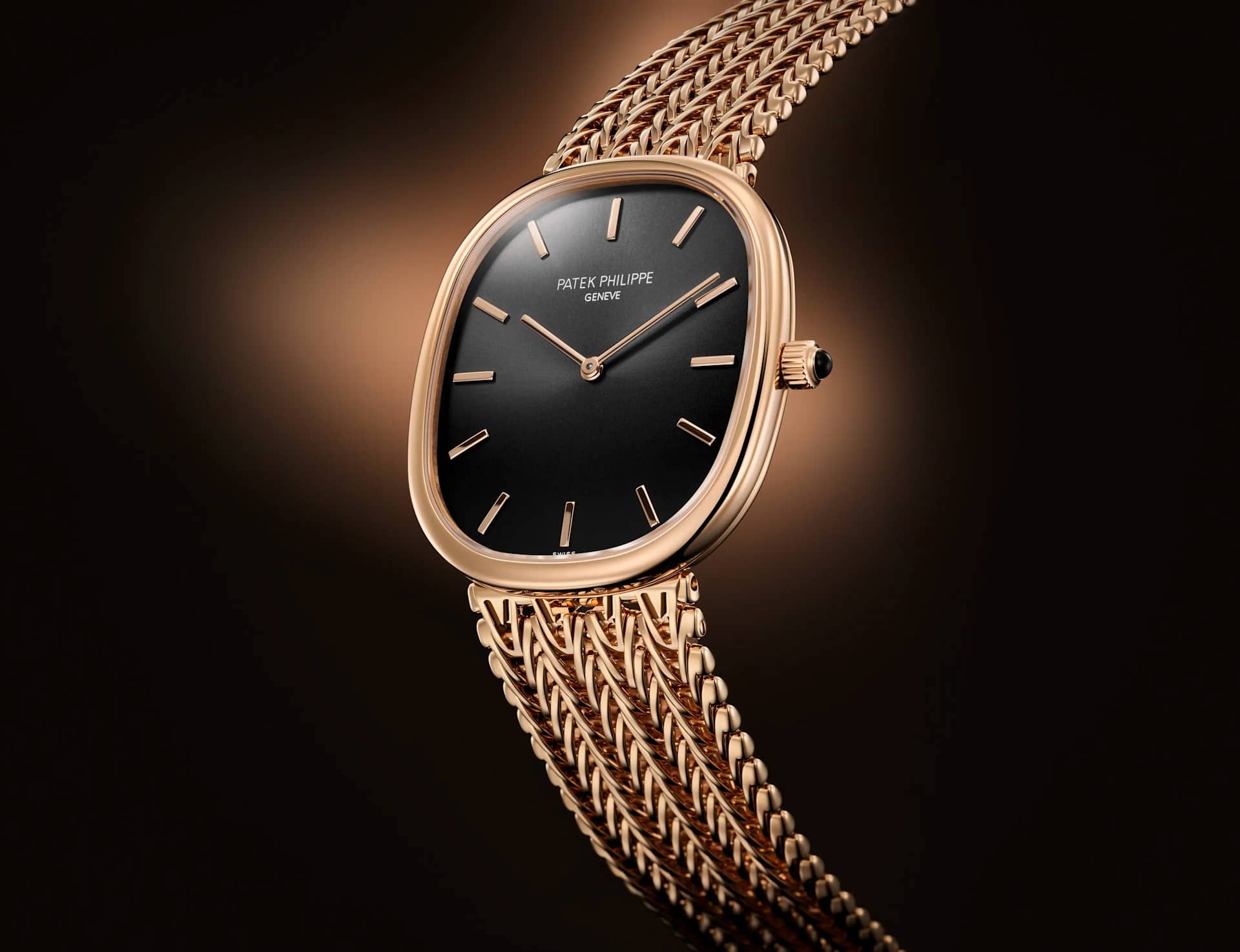
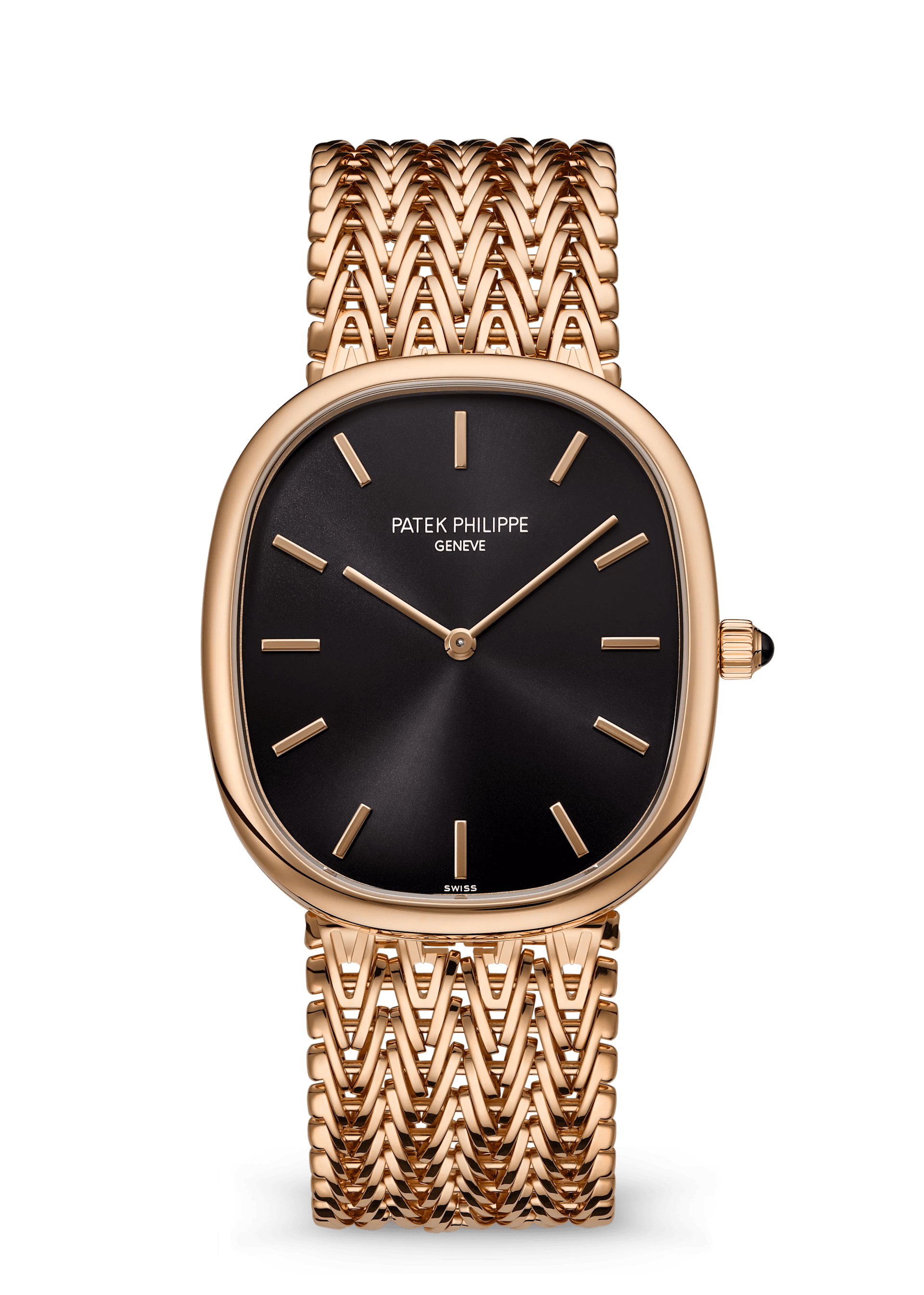
The Golden Ellipse 5738/1R offers a different allocation of attention. Thin hands and baton markers inhabit a large field of black; the case follows a softened outline between a rectangle and an oval. There is no date aperture and no seconds display to divide that field. The eye has room to notice the spacing between the markers, the distance from their tips to the hands, and the way the case narrows towards the bracelet.
The rose-gold chain-style bracelet is essential to this reading. Its closely repeated links make a textured surface beside the spare dial. Where the Calatrava places visual activity in a ring, the Ellipse extends it along the wrist. The quiet centre becomes more emphatic because its surroundings are so intricate. On a plain strap, the balance would be different: more isolated watch head, less continuous piece of jewellery.
The official dimensions are 34.5 by 39.5 mm and 5.9 mm thick, with automatic calibre 240. Patek associates the family with the golden ratio, but that historical design narrative should not be confused with a mathematical guarantee of beauty. The stronger evidence is visible in the object: a restrained dial, a thin edge and a dense bracelet that changes the apparent weight of both. This is a useful reminder that a bracelet is part of the composition, not merely a delivery system for a case.
The 5224R: elegance can require learning
At a glance, the blue-dial 5224R appears familiar: a round gold watch with Arabic numerals and small seconds. Look again and noon sits at the top of a 24-hour scale. The arrangement makes daytime occupy the upper part of the dial, but it also overturns the habits built by ordinary 12-hour watches. Familiar styling surrounds an unfamiliar reading convention.
The two time-zone hands distinguish their jobs through visual weight. A filled hand carries local time; an open hand indicates home time. This is an economical way to keep two readings on one dial without adding a separate subdial. It also reveals the compromise. A sparse-looking interface can still demand more interpretation, especially when both its scale and its hand hierarchy must be learned.
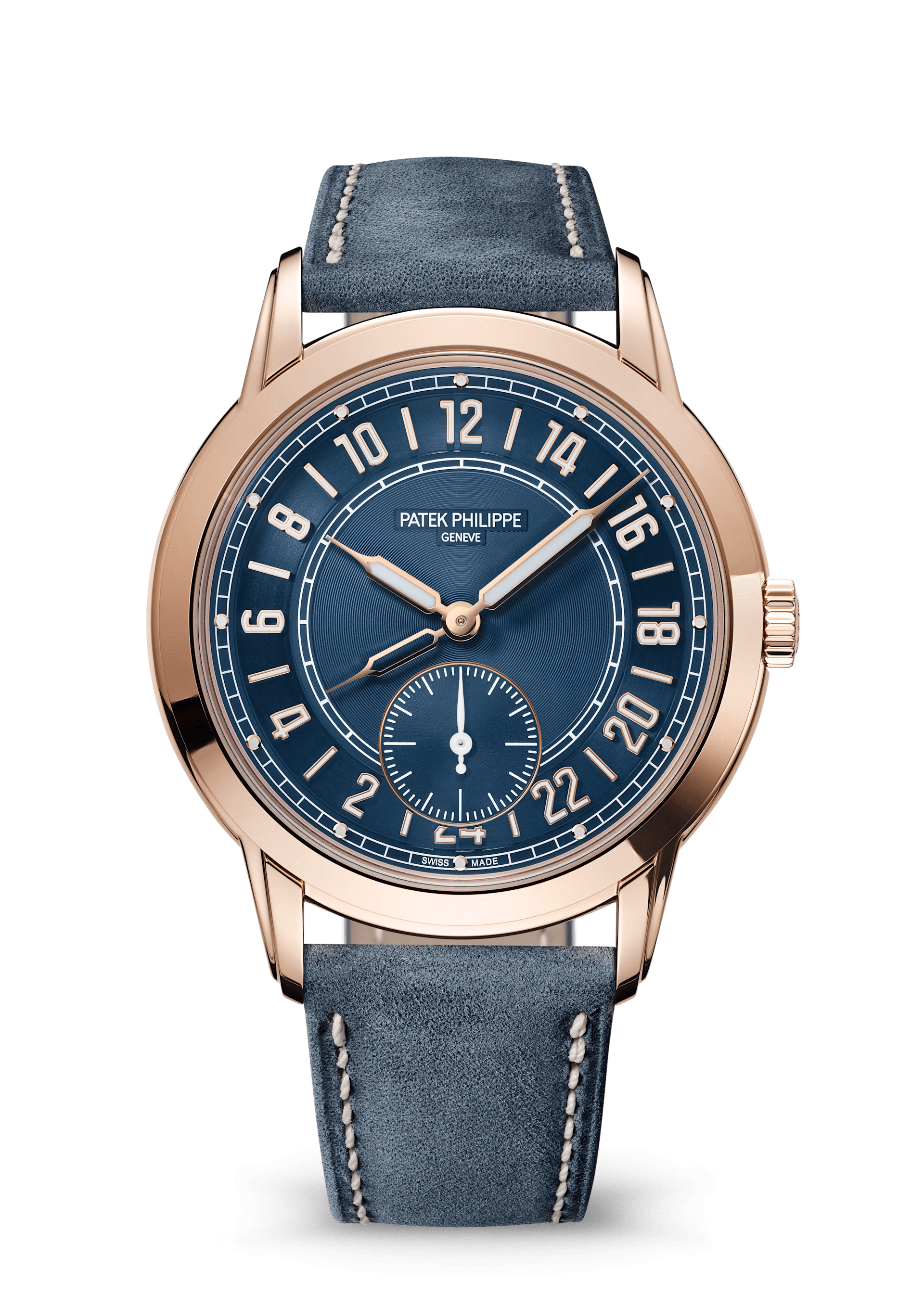
The 42 mm rose-gold case is 9.85 mm thick and contains automatic calibre 31-260 PS FUS 24H. A blue strap continues the dial’s colour beyond the case, while gold hands and numerals establish contrast. In this comparison it is the clearest example of refinement through organising information. Whether that organisation is preferable depends on the reader: someone who enjoys a 24-hour view of the day may find the display coherent; someone seeking an instant familiar glance may find its novelty a cost.
The 5326G: familiarity as camouflage
The 5326G takes the opposite route. Large Arabic numerals, beige luminous details, a textured charcoal dial and a tan strap give it the visual vocabulary of a practical instrument. Then the smaller indications begin to emerge: an annual calendar, local and home time, day/night displays, moon phase and small seconds. It is a complicated watch that initially lets the hour markers do the talking.
That first impression comes from differences in scale. Large numerals establish the primary reading; smaller apertures and indications occupy the gaps. It is an effective hierarchy in the official photographs, although a photograph cannot prove effortless legibility in changing light. The density is real. The calendar and travel functions do not disappear simply because their surroundings feel relaxed.
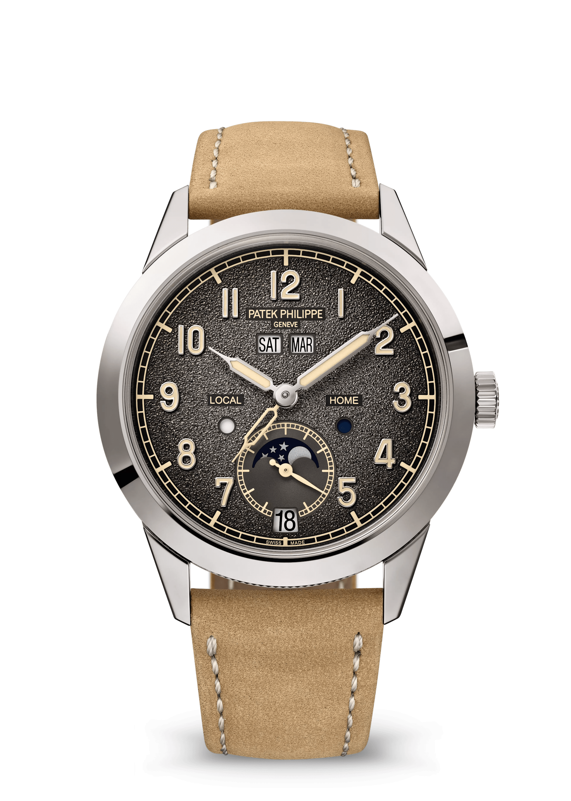
The white-gold case measures 41 by 11.07 mm. Its hobnail decoration sits around the caseband, moving a recognisable Patek detail away from the frontal view. Compared with the 6119R, ornament has migrated from a visible frame to a surface encountered from the side. That is a consequential shift: tradition is still present, but it no longer dictates the watch’s first impression. The 5326G suggests informality through texture and typography, without becoming a basic field watch.
The Cubitus: outline changes everything
The steel Cubitus 5821/1A is the strongest test of the argument. Olive-green horizontal dial relief, baton markers and a bracelet establish continuity across the face and attachment. The square-shaped case, softened at the corners, then changes the amount and distribution of visible metal. Broader upper and lower edges make the outline an active participant in the design rather than a neutral container.
Patek specifies 45 mm measured from 10 to 4 o’clock and an 8.3 mm thickness. That diagonal measurement should not be treated as directly equivalent to a round watch’s diameter. Nor does the shallow profile settle the question of wrist presence: width, corner geometry and the bracelet’s departure from the case all affect the impression. An assessment of comfort would require wearing it; the photographs support an analysis of its outline, not a verdict on fit.
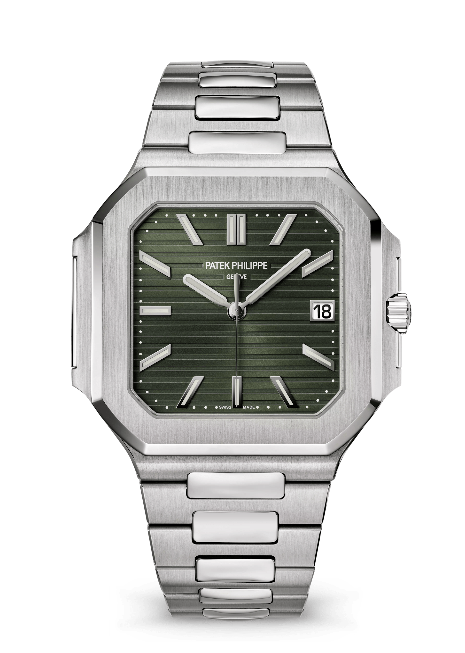
The polished and brushed surfaces divide the steel into separate visual planes, while horizontal dial lines pull the eye laterally. This makes the watch feel emphatic even though its functions are straightforward: hours, minutes, central seconds and date. The tension is productive. A relatively simple display can live inside a visually assertive object. Whether that assertiveness appeals is a design judgement, not something scarcity or a complicated movement can settle.
What connects the five
The shared lesson is that restraint is selective. The Calatrava restrains the centre. The Ellipse restrains the display. The 5224R organises competing time readings. The 5326G lets large numerals lead a densely populated dial. The Cubitus concentrates identity in the silhouette. Calling all five simply elegant hides the different work each design performs.
A useful way to look at any of them is to cover the logo, then ask three questions. What do I notice first? Which detail takes longer to discover? Does that sequence help me read the watch, or mainly help me recognise it? Patek’s most persuasive design decisions survive that exercise. They can be explained through edges, spacing, contrast and proportion, before prestige enters the conversation.
Research note — 3 November 2026. This is a source-based visual comparison of official Patek Philippe product photographs and published specifications, not a hands-on review. Dimensions and movement information are manufacturer specifications. No current retail availability, pricing or release date is asserted. Official reference pages are linked below; photographs are credited to Patek Philippe.
Share this article
Sources & research
Research checked 2026-11-03. Specifications are manufacturer figures; interpretation and calculations are identified in the text.
- https://www.patek.com/en/collection/calatrava/6119r-001
- https://www.patek.com/en/collection/golden-ellipse/5738-1r-001
- https://www.patek.com/en/collection/complications/5224r-001
- https://www.patek.com/en/collection/complications/5326g-001
- https://www.patek.com/en/collection/cubitus/5821-1a-001


