Design & Culture
The shape of time: why unusual watch hands matter
From Breguet’s hollow circles to Tudor’s luminous squares and the unconventional geometry of independent watchmaking, watch hands are tiny pieces of industrial design with an enormous influence on how time feels.
- Release date
- Unknown
- Source published
- Not verified
- Added to Chronolume
- 2026-11-10
- Article published
- 2026-11-10
- Research checked
- 2026-11-10
Chronolume · Source-based analysis · Research checked 2026-11-10
Save this watch to revisit later.
Owner-supplied design essay, checked against existing Chronolume reporting and five exact-model photographs. Tudor’s official account confirms the 1969 catalogue introduction and luminous-area rationale. Source-based visual interpretation; no hands-on testing, underwater testing or measured reading-speed claims. The Casio article link was corrected before publication.
The analysis
### The smallest part with the biggest personality
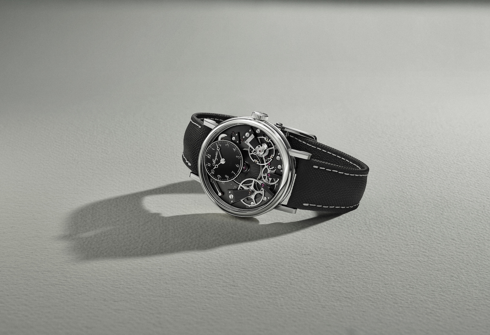
Remove the logo from a watch dial and its hands might still tell you who designed it. A pair of slender, open-tipped Breguet hands evokes centuries of classical watchmaking. Broad, angular Tudor Snowflake hands signal a modern tool watch. A colourful seconds hand can turn a restrained three-hander into something playful.
Watch hands seem like mere pointers. But their shape decides how we distinguish hours from minutes, how quickly we locate the time in darkness, how much of the dial remains visible and whether a watch feels formal, technical or unconventional. They are simultaneously instruments and visual signatures.
### Breguet: the circle as a signature
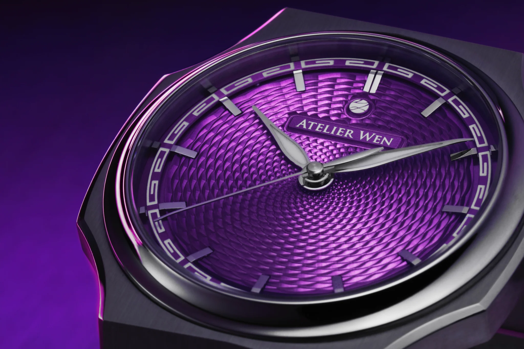
The characteristic Breguet hand is thin, gently curved and pierced by an open circle near its tip. The tiny ring adds ornament without turning the pointer into a heavy object. Against finely worked dials, the contrast is compelling: the surrounding surface may be elaborate, but the hand itself remains airy.
It is an exercise in visual restraint. The circle becomes a recognisable marker, while the long pointed extremity still indicates a precise minute. On a dial crowded with decoration, this kind of delicate silhouette creates breathing space.
Related Chronolume reading: Breguet and Engineered Elegance.
### Tudor: the square that changed dive-watch language
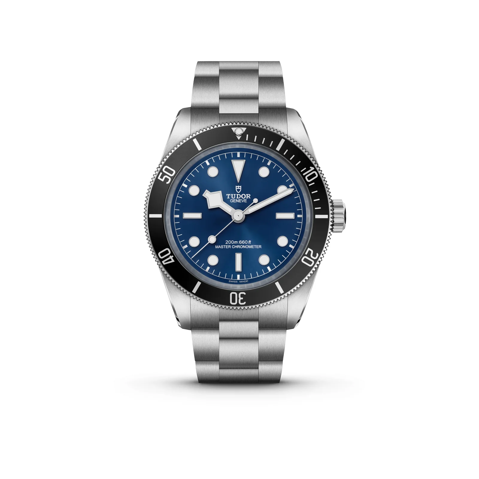
Tudor’s Snowflake hour hand makes almost the opposite argument. Its large angular luminous section is impossible to mistake for a slender minute hand. First seen in Tudor’s 1969 dive-watch catalogue, it gave the hour indication a distinctive silhouette and space for a generous amount of luminous material.
That difference between hour and minute hands matters underwater, at a glance, or in low light. The hand shape becomes part of the interface rather than decoration applied after the watch is designed. Its endurance also shows how a practical solution can mature into a brand signature.
Manufacturer reference: Tudor — The How of Hands.
### PS Horology: design follows the scale
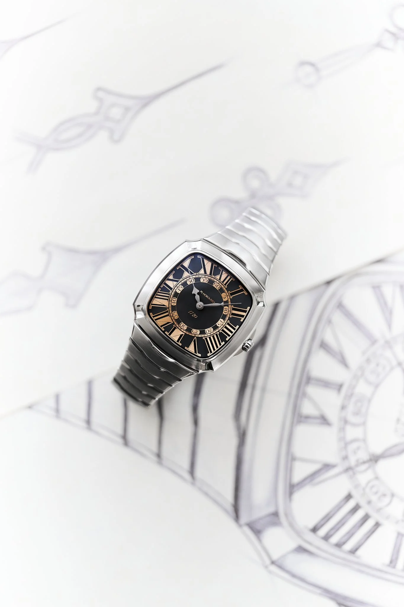
Sometimes the unconventional hand is a response to an unconventional dial. The PS Horology Tsuba 1720 places its hour scale outside the minute indications. That reversal creates a practical challenge: an ordinary, shorter hour hand would not naturally point to the correct track.
Its extended hour-hand geometry answers the problem. This is an interesting case because the unusual shape is not a purely expressive flourish. It follows from a different system of reading time. The hand and dial form one coherent design decision.
Related Chronolume reading: PS Horology Tsuba 1720: when the hands must follow a new set of rules.
### Otsuka Lotec: move the pivot, change the language
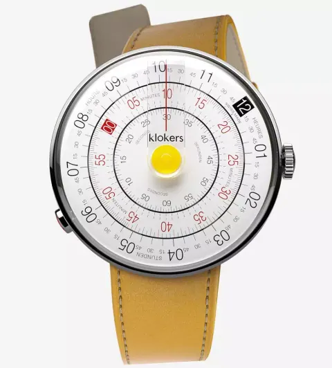
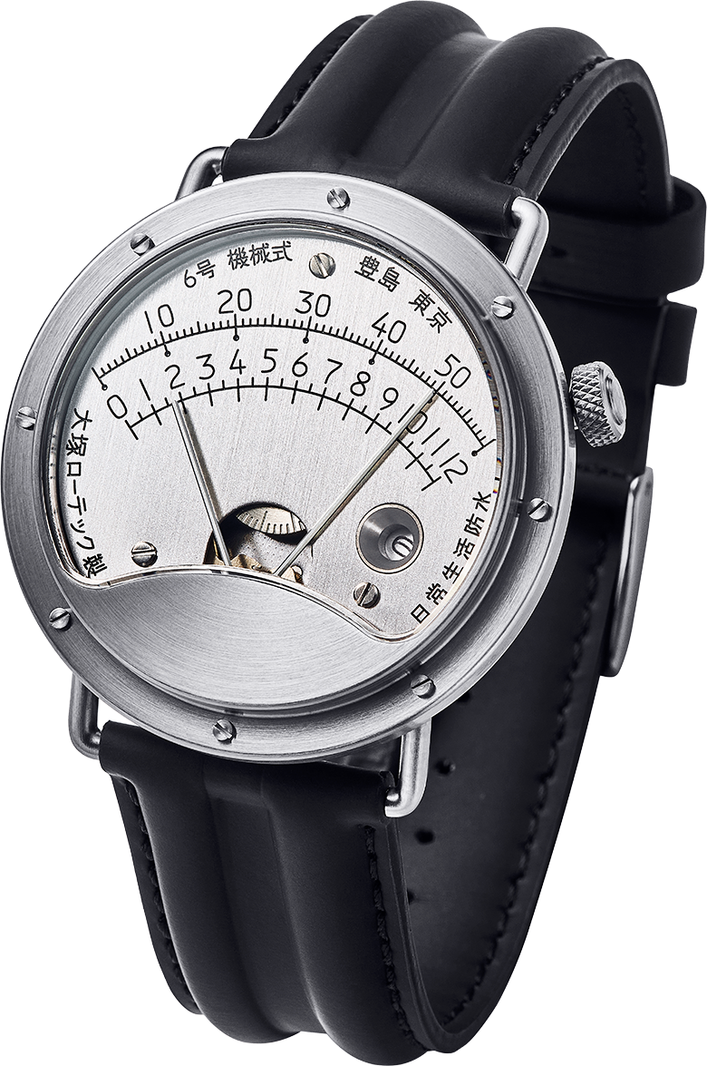
Traditional hands radiate from the middle of the dial. Otsuka Lotec’s No. 6 challenges that assumption by locating its indicators low on the face and arranging the hour and minute indications around an upper, fan-shaped scale. Its layout recalls a mechanical measuring instrument more than an ordinary wristwatch.
Here the remarkable thing is not the ornament on the hands but their position and path. Move the centre of rotation and every other design choice changes: scale, negative space, visual hierarchy and the rhythm of reading. The familiar act of checking the time becomes momentarily unfamiliar.
Related Chronolume reading: Designing with shadows: inside Otsuka Lotec’s mechanical architecture.
### A single coloured hand can change everything
Not every distinctive hand needs complex geometry. The yellow accent on the Casio MTP-B220BL-1A shows how colour can define a watch's identity. Against a quiet grey setting, one bright pointer directs the eye and gives the dial a sense of movement even when it is still.
The design lesson is about hierarchy: one element does more work when the surrounding elements remain restrained. A single flash of colour can be more memorable than an entire dial of competing accents.
Related Chronolume reading: One yellow hand: why Casio’s MTP-B220BL-1A is so compelling
### The space between legibility and expression
There is no universally perfect watch hand. A broad luminous hand is useful for a diver but might overpower an elegant dress dial. A delicate open-circle hand creates character but cannot offer the same glowing surface as a Snowflake. A radically relocated pivot encourages curiosity, but requires a little relearning.
What matters is whether the hand belongs to the watch's larger argument. Good hands work at three levels: they point accurately, they remain distinct from one another, and they make the design recognisable. The smallest moving objects on a watch can also be its clearest expression of purpose.
Share this article
Sources & research
Research checked 2026-11-10. Specifications are manufacturer figures; interpretation and calculations are identified in the text.
- https://www.tudorwatch.com/en/tudor-mag/craft/the-how-of-hands
- https://chronolume.page/article/breguet-design-philosophy-engineered-elegance-2026
- https://chronolume.page/article/ps-horology-tsuba-1720-hands-follow-the-scale
- https://chronolume.page/article/designing-with-shadows-otsuka-lotec-mechanical-architecture
- https://chronolume.page/article/casio-mtp-b220bl-1a-gunmetal-yellow-2026